It's been in the planning for a while, but we are finally on the cusp of embarking on the biggest project for our new house - the kitchen! It's not going to be quite as big a job as I'd originally planned as unfortunately the costs for what I wanted to do were just out of our budget (£6K to take out half of one wall for a start!) We aren't doing any structural work now, just replacing the kitchen, the flooring and decorating. It'll be a little while before I reveal it on here, so in the meantime I thought I'd share what the plan for it is and fingers crossed it all turns out how I've envisoned it!
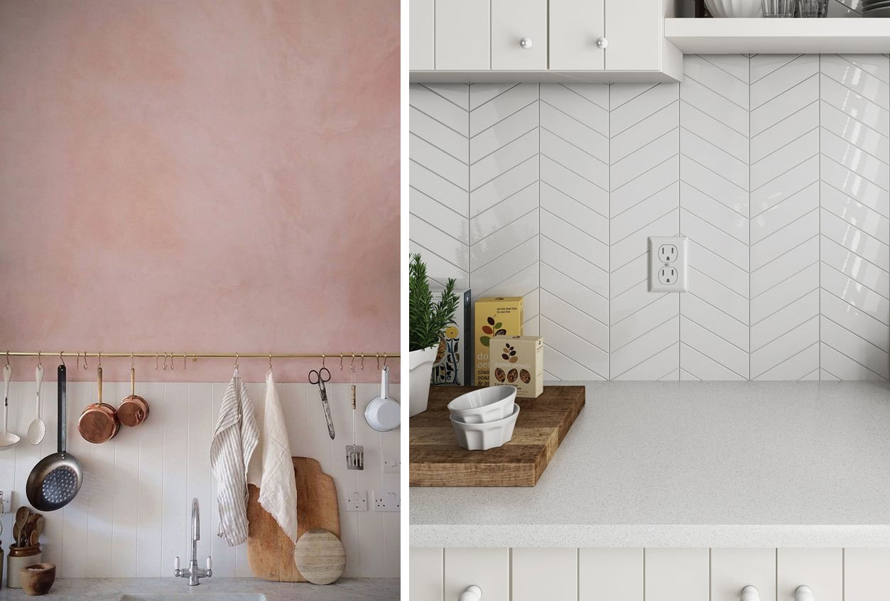
Left: via eBay, Right: via Cantilever Interiors
If you are a regular reader, you'll have heard me harp on about plywood before, and we have decided to go for plywood door and drawer fronts, similar to the left hand pic above. We have employed a carpenter/builder to custom make these so I'm really hoping they turn out well. The plan is to have open shelving also made from plywood with the wall below the shelving tiled and the wall above it painted in pink! The worktop is going to be like the one in the right hand pic above - thick plywood backed in white formica.
Left: Pinterest (unsure of source), Right: Tiles Direct
I haven't got them in yet, but I think we are going for these chevron tiles. I have tested out SO many pink shades of paint at varying price points, and I was undecided until the other day when I picked up another sample from Wilkinsons, and amazingly when we both looked at it on the wall we both agreed it was just the right shade!
We'll keep our existing cream Smeg, and our current washing machine and dishwasher. There will be a little utility corner at one side of the kitchen for the washer and dryer which will be nice to have separate from the food prep areas. I have ordered the above hob and extractor from ao.com - which are both designed by Patricia Urquiola - I love the industrial yet simplistic feel of the hob. I found it really hard to find extractors that I liked, but this one really stood out and had lots of great reviews.
I spent a serious amount of time agonising over the floor. It's quite a big area and leads into our conservatory / dining area. Initially I was looking at tiles, but just couldn't decide on what would work, particularly as it would lead directly from our hallway which we are about to lay some bold statement tiles in.... so in the end, we thought going with a wooden floor would be best. I've earmarked this pale engineered oak, so hopefully that will look nice and light and fresh.
I want to keep the kitchen quite simple, uncluttered and fresh, but with a little bit of interest on the open shelving with plants, lovely ceramics and artwork, so watch this space! I can't wait to show you when it's done! Do keep an eye on my Instagram for mini updates when it starts in a few weeks! ;)


