Decorating brands I'm loving...

If you are a regular reader (of my not so regular posts! sorry!) then you might know that we have been going through a very long drawn out process of selling our flat and buying a new property. In September, it will be a whole YEAR since we put our flat on the market! BUT we are finally seeing light at the end of the tunnel and are just waiting to agree dates for exchange and completion. (fingers still firmly crossed!) 

I've literally spent the last 12 months imagining what I am going to do to the house we were buying, and have even started looking at paint colours and wallpapers in preparation! So now that our wait is *nearly* over, I am gradually gathering samples together, so I thought I'd share with you a couple of really great decorating brands that I've fallen in love with. 

I came across Bert and May a while ago, and blogged about their barge boat which you can stay in on the Thames. I have fallen in love with their tiles, wood flooring and cladding and their paint range. Above are a few sample pots I have tested out, and I love the soft, muted tones and the chalky matt finish. The palette is inspired by their stunning range of tiles, so naturally they go perfectly together. And I am totally loving the idea of a tiled headboard! 

I am a big wallpaper fan, but I am quite fussy about it. I feel like it is quite a bit of effort to hang and I want longevity from it, so I really want to make sure I truly love the wallpapers I choose. 

So, I am always really excited to find a wallpaper brand that has lots of designs I love, and I can safely say that about Sandberg Wallpapers. I've admired their work for a while, and recently received a selection of samples from their Familj range, which is launching this month - and there really is too many lovely designs to choose from! 

I'm also planning a little bit of furniture painting with some pieces I already own, that are a bit tired and either need to go or could be transformed with a lick of paint. So I'm delving into books like this one from founders of interiors brand Grand Illusions to give me a few ideas! 

Once we get into the new house, I'm sure I will have lots of projects to share on here, just keep your fingers crossed for us that we get things signed and sealed soon! ;) 

The history of my home

A few months go I had the most intriguing of emails. It came from a woman who had lived in my house nearly 20 years ago. She had come across pictures of our kitchen/dining room online, and spotted the fireplace which she had purchased in an antiques shop in Glasgow in the 1980's - apparently it was bright orange when she found it! She cleaned it up and brought back to Kingston to install in the house. Shona emailed me to let me know of this crazy coincidence and we began chatting about the house and what it was like when she lived here. It really is incredible the connections that can be made via the world wide web right?! 

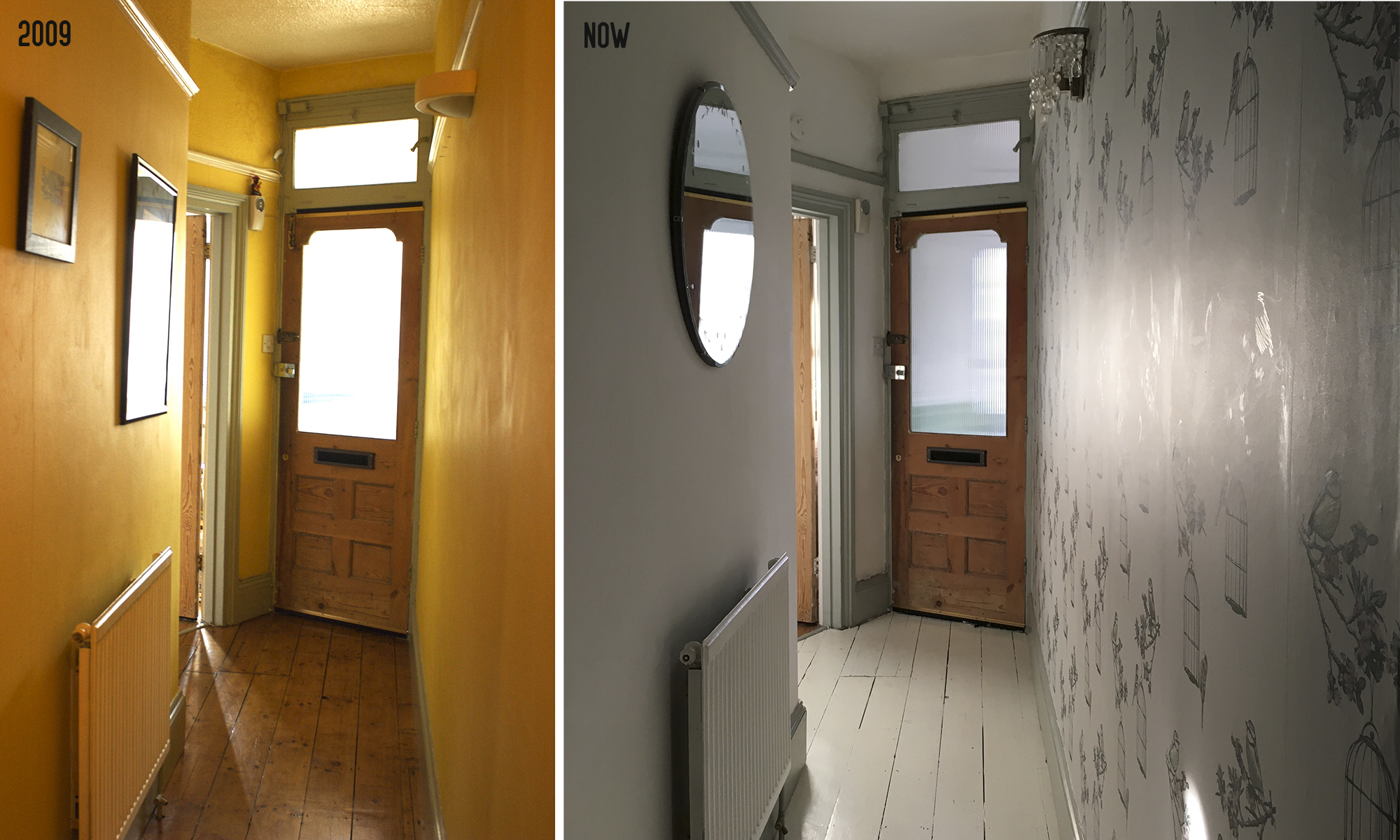
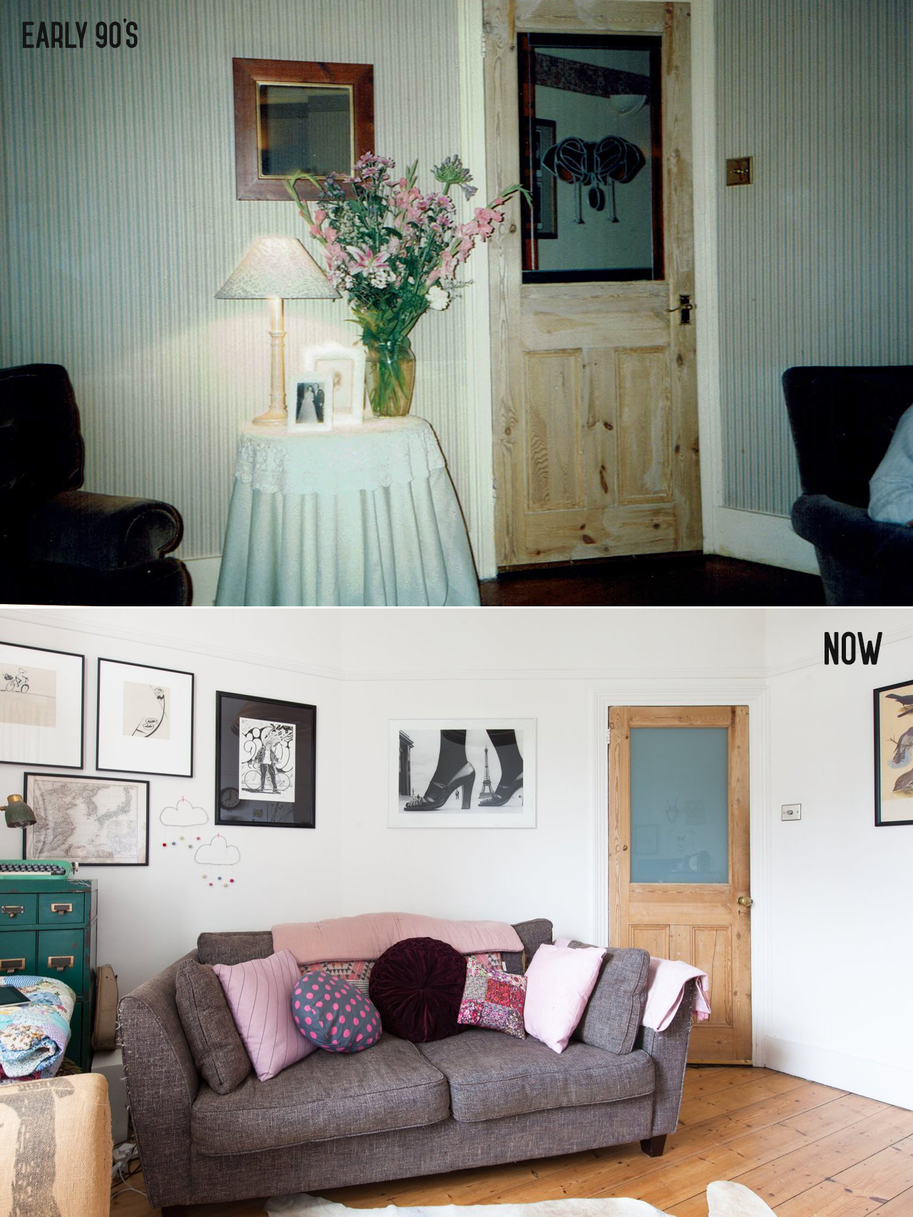
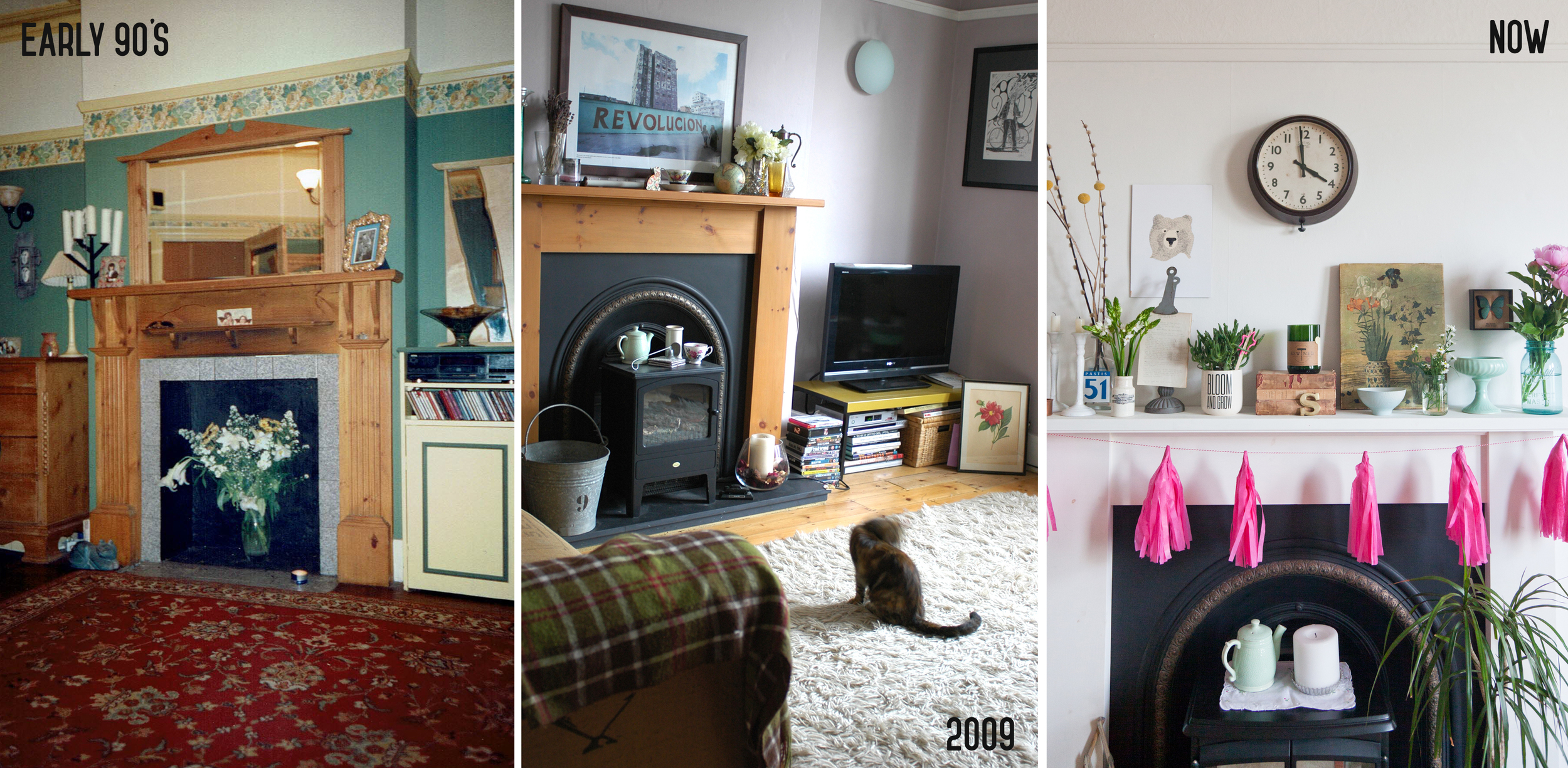
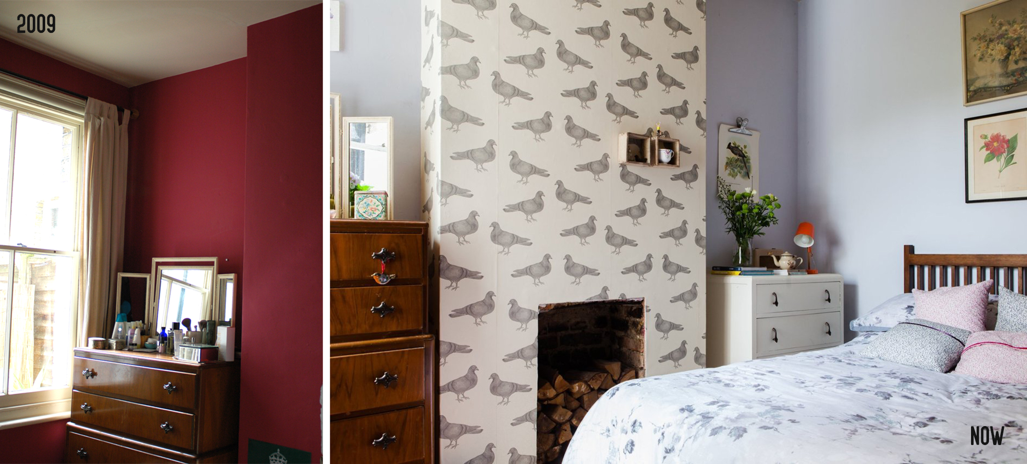
It feels particularly poignant to be looking back on the history of our home, as we prepare to move on from it ourselves after nearly seven years of living here. (that's if we EVER exchange, it's been the longest process). Shona sent me a few pictures of the interior when she was living here which was SO interesting, so I thought it would be fun to show the comparisons (which also includes some shots from when we bought it in 2009) and I did a little interview with Shona, to find out about her time living here... 

Now image by Cathy Pyle

Now image by Cathy Pyle

Patchwork Harmony: When did you live in the flat?
Shona: 1989-1997

Patchwork Harmony: What was the house like when you bought it? 
Shona: Not great, it needed totally refurbished - it was in a real mess. It needed a new bathroom, kitchen and it didn't have any central heating so that had to go in too. Before buying the flat we looked at one of the top floor flats next door, which was immaculate but I think about 25k more (!) - that gives you an idea of how much work needed to be done on it. I think the purchase price was around 72k.

Now image by Cathy Pyle

Now image by Cathy Pyle

Now image by Martina O'Shea

Now image by Martina O'Shea

Patchwork Harmony: Do you know any history of the house prior to you living there? 
Shona: I think it had been rented, although for some reason I think I was told squatters had been living there before we moved in!

Patchwork Harmony: What are your memories of living here?
Shona: I had an interesting time there. It was exciting in the early years as I had moved down from Scotland and just started my career. It was my first step on the property ladder. I got married when I was living there and then divorced just after I left the house so it's a place of real mixed memories and emotions. I also got two cats when I was there: Pyramus and Thisbe and my fondest memories seem to be of them as kittens!! I asked my friend if she had any interesting memories of the house and she said she remembered dancing a lot!

Now image by Cathy Pyle

Now image by Cathy Pyle

Patchwork Harmony: Did you make many changes to the house in terms of layout etc? 
Shona: The kitchen was made slightly bigger. The only other thing was the garden was really small and as we got on well with our neighbour we decided to make it one large shared garden instead of two smaller ones.

Patchwork Harmony: Things are very different now from when you lived here in terms of where homeowners find inspiration for decor - how did you go about it back then? Where did you find ideas? Where did you shop for home furnishings etc? 
Shona: If I remember correctly I loved Habitat, Laura Ashley and Designers Guild. I must have got inspiration from magazines and my brother is a designer so he was a great help. I remember I had to learn how to make soft furnishings as it was too expensive to buy them all - curtains, cushions etc. Festoon blinds were all the rage in the 80s :)

Patchwork Harmony: How long did you live here for and why did you decide to move on? 
Shona: From 1989-1997 then we moved about fifty metres up the road until 2006!

Thank you Shona for getting in touch and giving this little insight into the history of our home! I don't know if this is interesting to anyone else, but I felt the need to document on here even if it just for myself. 

I guess when you are about to move on from a home that has been so important in your life, it is a nice time to reflect on and look back on your time there. It was our first home we purchased together, we became a married couple while living here, and we brought our first child into the world here, not to mention that the magazine I founded is named after this place! It's funny how there are some similarities in the life events Shona experienced while living here too. Her email definitely wins the prize for the most intriguing of the year! 

Becoming brave with colour

Whenever I watch programmes like The Great Interior Design Challenge and they say 'be brave with colour' and then the contestants proceed to paint a room in deep red or lime green, I find myself shouting at the telly with cries of 'noooo!' and 'why??!'. For me, being brave with colour is not about going over the top with something you probably wouldn't normally go for, just to prove you're 'being brave' - it's simply about introducing colour naturally, choosing shades that you know you will love to look at and that will complement the rest of your decor. If I'm honest, I haven't been brave in our current home when it comes to paint colours - every room is white, except the bedroom which is Pale Cirrus from Fired Earth, a very pale blue grey. I've added colour in other ways, through accessories and art work, as these are easy to change. 

We've also already agreed that when we (finally) move into our new place, we will paint everywhere in white to start with (there are some pretty ghastly colours and one mural (!) to cover over!!) and then work around each room decorating properly. But I do wonder if I may try to be more brave this time? These images which I received from Dulux this week have instigated these thoughts, as while they are still fresh and mainly white, the use of colour really is inspiring...

I particularly love the use of colour on the sloping roof, and it's something I'll keep in mind for the loft room. These shades look so fresh together and not at all sugary despite being on the pastel spectrum. Using two shades of blue in the below image also works fabulously... (side note; I'm also loving these polished concrete floors!) 

If you simply can't stray from all white walls, then this last shot is a great way to add a few pops of colour in a subtle yet 'brave' way... the challenge would be getting all those circles perfectly lined up! 

What do you think? Are you brave with colour or are you like me, and find it hard to commit to painting with anything stronger than chalky pastels? 

What to do with a 'sort-of' conservatory

So in case you were wondering... no, we still have not moved house! After putting our house on the market in September and having an offer accepted on the place we are buying in October, it does seem to be taking an AWFULLY long time! There was mention of an exchange date today though, so perhaps the end is in sight.

But when it's been this long since you saw the place you about to move into, your brain does start to play tricks on you about what said house actually looks like. Our new house has what I would call a 'sort-of' conservatory. It had a sloped glass roof, but it has solid walls and only a slim envelope window along the top of the wall. In my mind, it looks (or could look) a lot like some of these images, but in reality it is VERY far from looking anything like this! 

While I KNOW it definitely won't ever look this fabulous, I do think it's possible to work with what you've got (at least to start off with until you can afford big transformations) so these images can at least spark some decorating ideas if nothing else. I am also assuming that with the presence of a garden room in my life, I will automatically be transformed into a green-fingered guru, and that my house plants (the ones that are still alive) will now flourish in this light-filled space! That will happen right?! 

I like the idea of an exposed brick wall, either painted or bare, and a tiled floor. The two images below have both of these elements but in very different ways, and both very lovely. It would be nice to have an almost Mediterranean terrace feel mixed with a bit of a Petersham Nurseries vibe I'm thinking...!

L: via Pinterest R: via Pinterest

L: via Pinterest R: via Pinterest

There is SO much work to do to the whole house when we move in, it is a HUGE project but hopefully one day we will have a lovely little sunny room similar to these (even a little bit!) to curl up with a book and a glass of wine! Watch this space to see how we get on! :) 

From nursery to toddler room

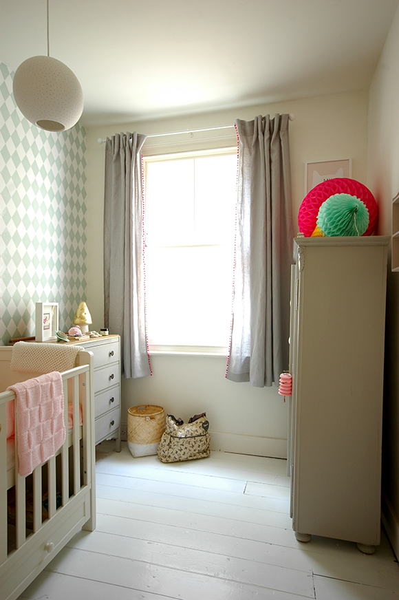
So it seems I am now officially the mum to a toddler, not a baby. I honestly don't know where the time goes. One minute they are sleeping in a tiny moses basket next to you, next they are scrambling all over your furniture like a excited puppy! Ruby is 19 months now, and is of course still sleeping in a cot, but I've been thinking recently about giving it a little update as she gets older, and will very soon have grown out of her sleeping bag. So whenever Silentnight got in touch to ask me to take part in their 'Room for a little one' campaign, it seemed like a good opportunity to give her sleeping quarters a mini update! 

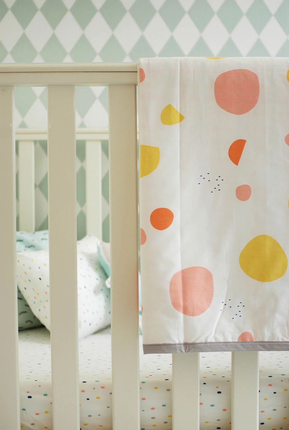
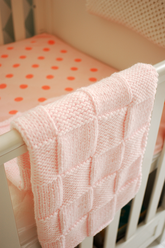
I choose some lovely bedding from Olli Ella, whose designs I've admired for a while. I went for a fitted sheet and pillow in their confetti pattern, and a blanket in Terra and Tartine. 

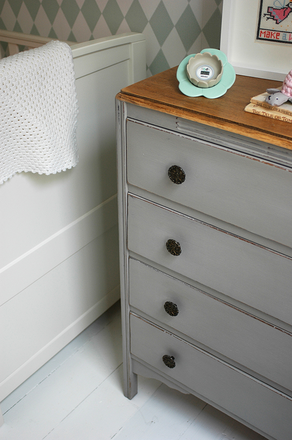
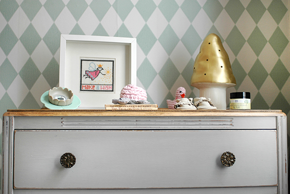
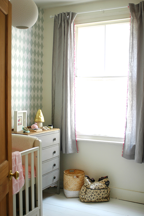
It makes such a difference to the cot, as before there was just a plain white sheet on the mattress, so it looks much more 'grown up' and part of the room decor. Plus the bedding goes perfectly with the existing wallpaper.

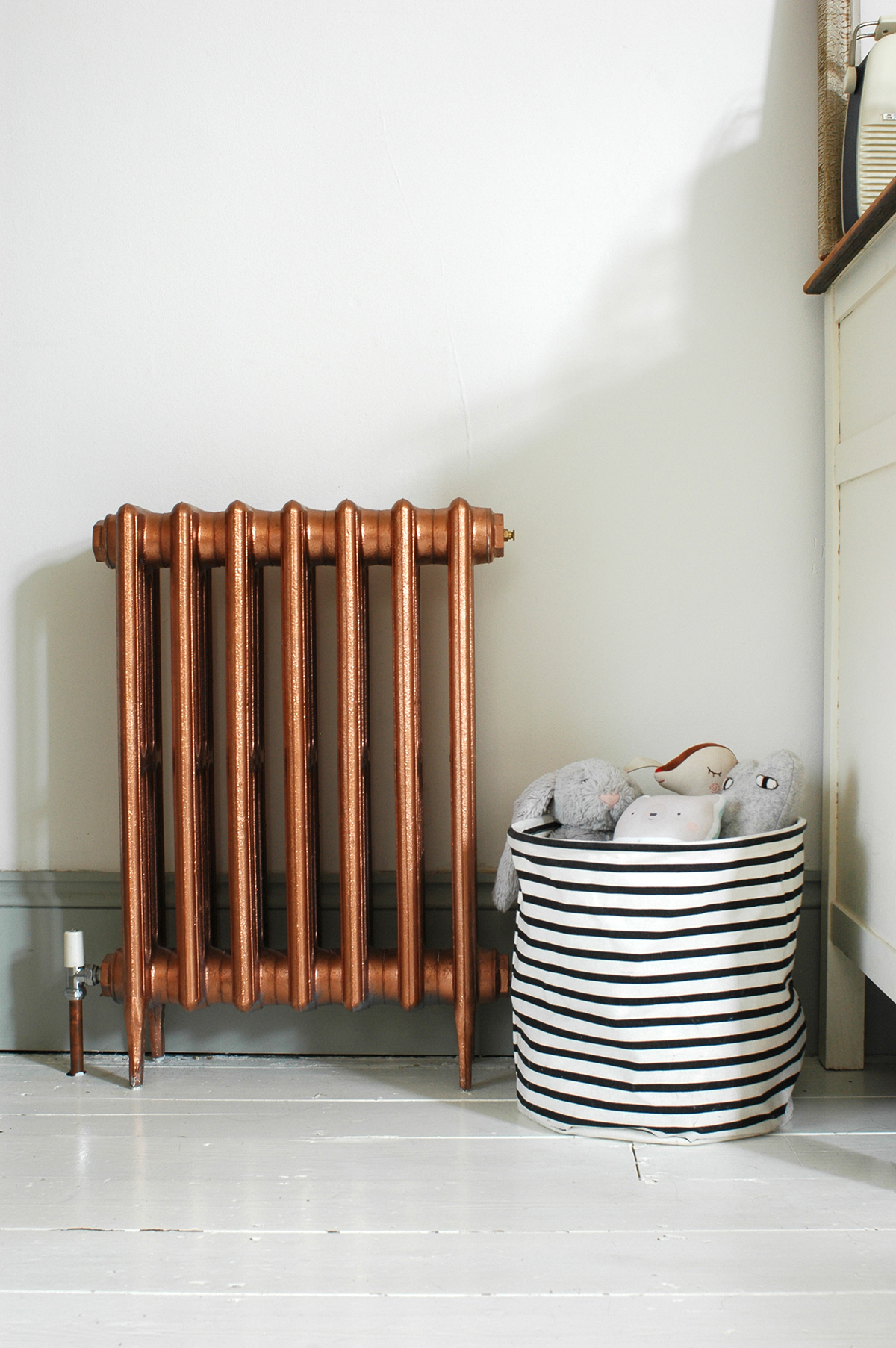
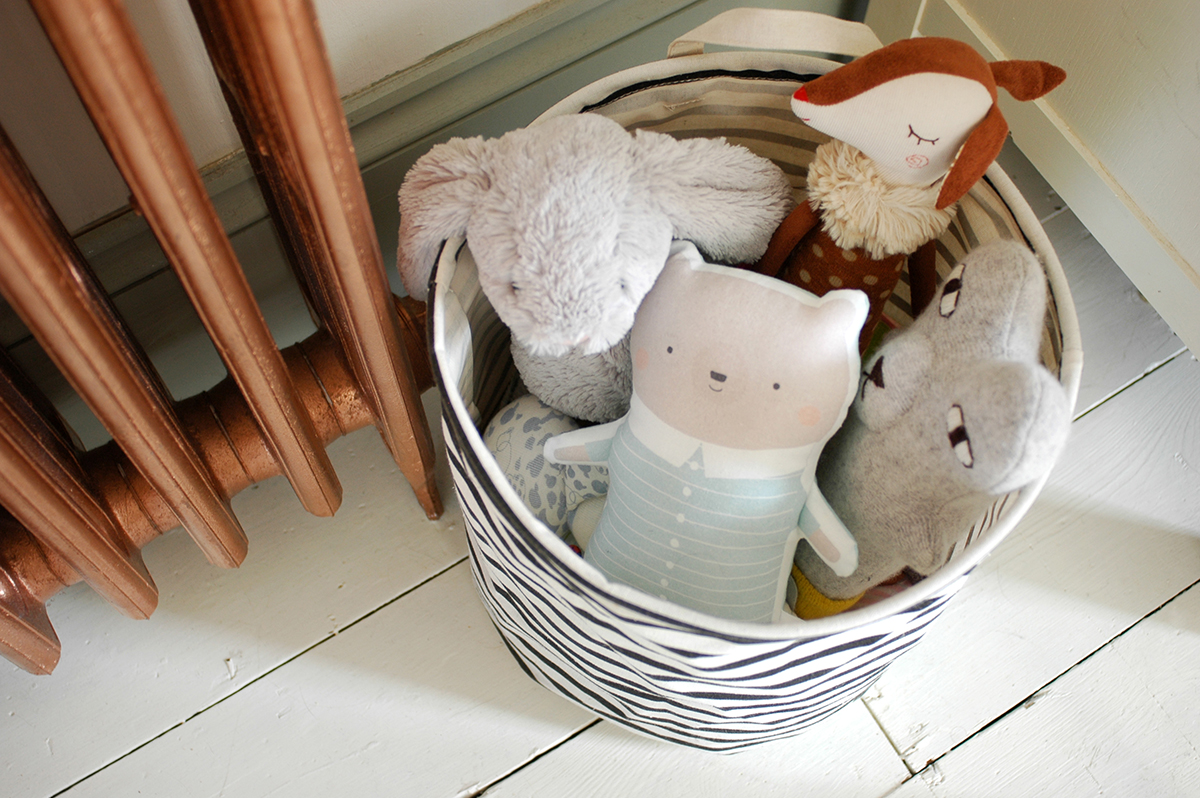
The other thing with a growing toddler is the ever increasing accumulation of 'stuff'. I've talked about storage for kids before, so you'll know I'm always on the look out for lovely baskets, boxes or bags to incorporate, so I also ordered one of their lovely belly baskets to help with the expanding toy collection! (I may have had my eye on one of these for some time!) Ruby's comment when she saw the new basket in her room was simply 'what's that?!' I'm sure she'll appreciate its beauty one day! 

I think new bedding is to a bed, what new cushions are to a sofa. It can make such a huge difference and generally for very little expenditure. It's a transformation that literally only takes a few moments! The next thing will be when she is ready for the cot to be turned into a bed! That really will bring home how fast she is growing up! 

This post was created in collaboration with Silentnight. All product choices and views are my own. 

Utilising your space for storage

I'm sure I'm not the only one who struggles with storage in the home. It's a constant battle right?! I was recently asked by Harvey's Furniture to share three storage ideas so I thought I'd share some that have worked for me in my own home. Finding good storage solutions is about utilising all the space that you have, but also making sure it looks good. If like me, you don't have a loft, then it's necessary to find ways of using each corner of your home, without it just becoming cluttered and messy. 

1. Use the space above you

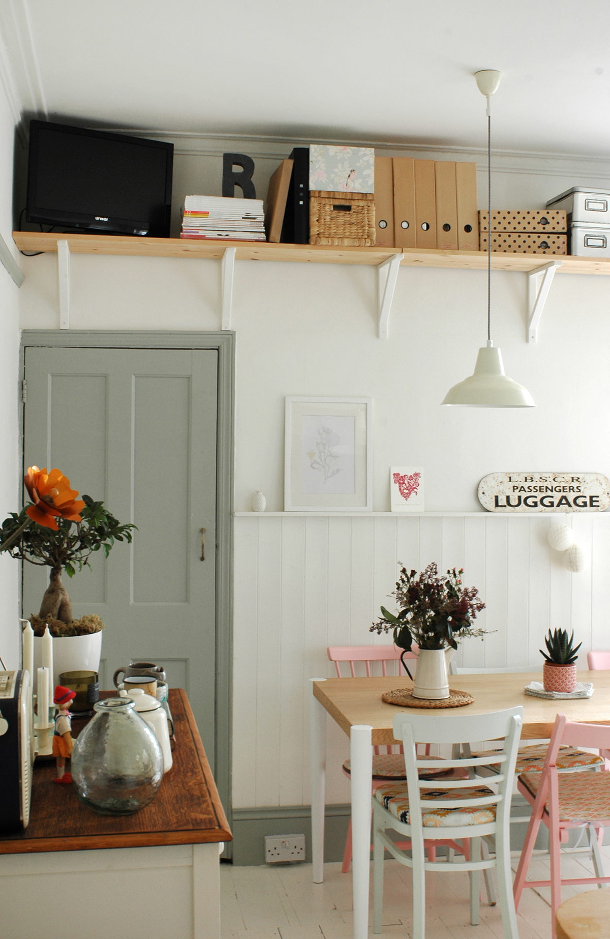
When we had to transform my office into Ruby's bedroom, I was left with a lot of boring files of paperwork and boxes of other admin type stuff I couldn't get rid of. I had no cupboard space available to hide them away, so instead we installed some shelving up above the line of the door to store these. They are things that don't need accessed on a regular basis so it is fine for it not to be easily accessible, but make sure you keep it orderly and neat otherwise it will just be an eye sore. The other idea is to create a fun fabric curtain to pull across and conceal it. I had actually planned to do this, but decided I quite liked the slightly utilitarian look of the shelves. 

2. Choose stylish bags and baskets

With things that do have to be easily accessible, such as toys, lovely storage bags and baskets are a perfect solution. BUT make sure they are lovely! I could never bring myself to buy those horrible plastic storage boxes as they are so ugly, and then you have to find somewhere to conceal those. Pretty baskets and other containers are readily available, so choose some that suit your decor and make them part of it. They can slot in anywhere where you have a little gap, and the kids can move them around as and when they like. Plus it's super easy to tidy up at the end of the day! I published a post recently about some great options you can find online

3. Make a feature out of existing spaces

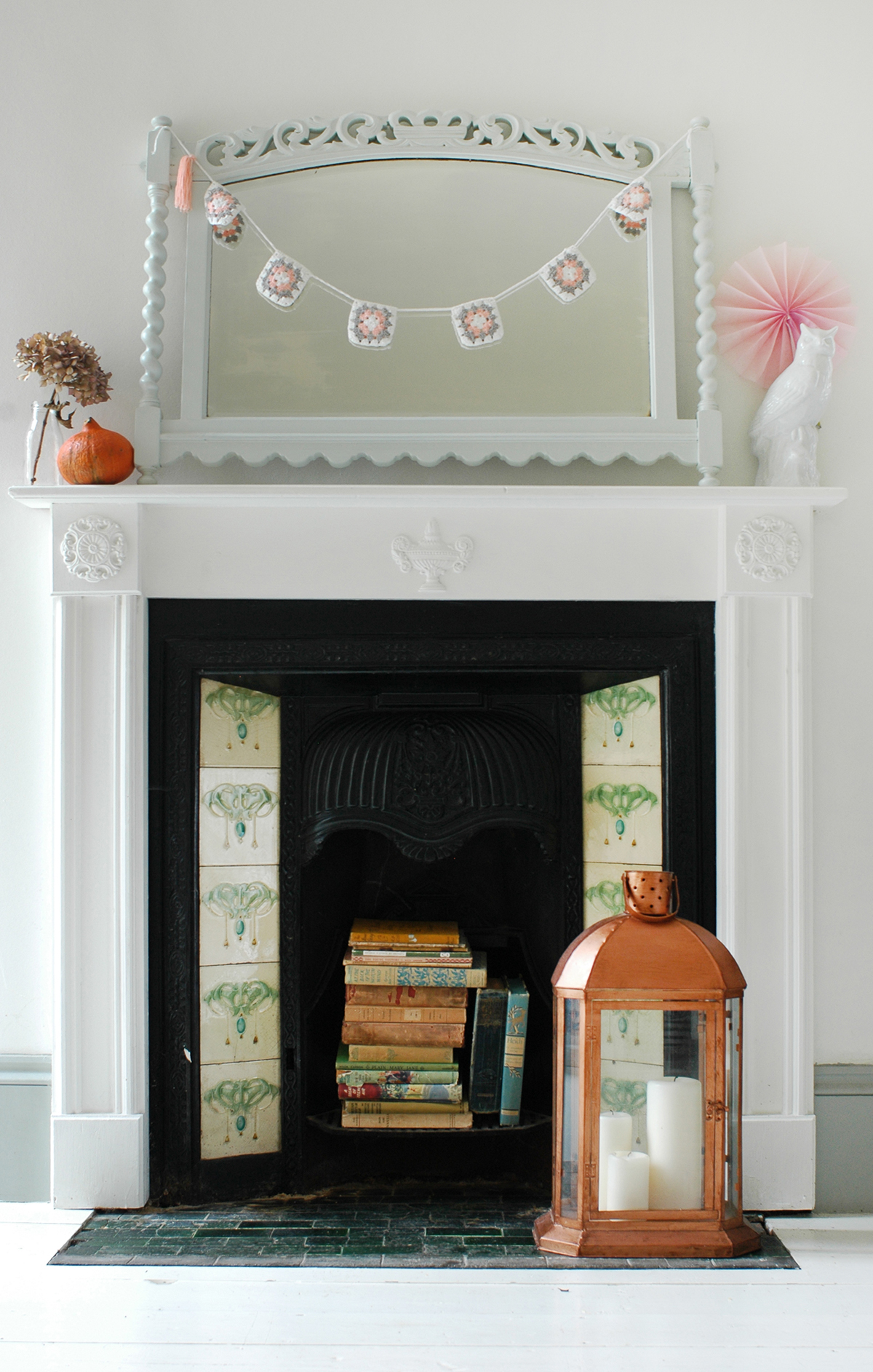
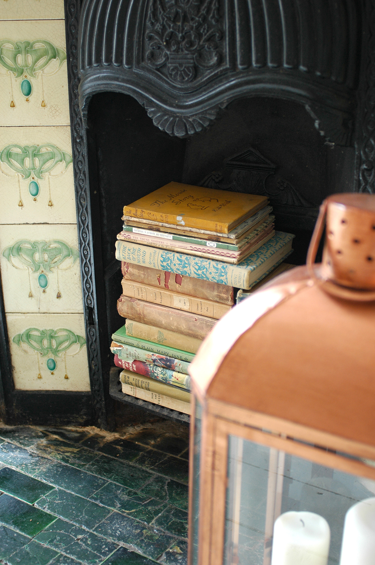
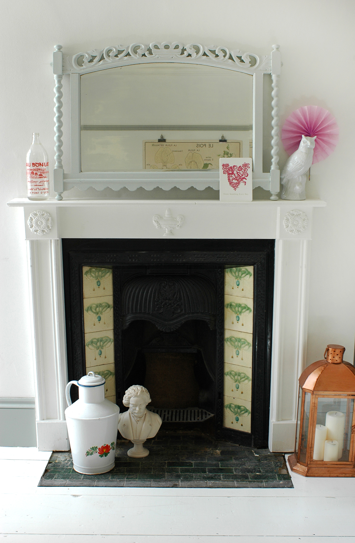
Try to make use of awkward nooks and crannies, making them into an interesting feature instead. We have this beautiful fireplace, but it is not a working one, so I decided to stack up some old books which I often use as props for photos in there. It means my beautiful old books are on display rather than packed away in a cupboard, as well as making use of the otherwise dead space. 

What storage solutions are you most proud of in your own home? I'd love to hear!
This post was in collaboration with Harvey's Furniture,. As well as my tips, you can read two other bloggers top storage ideas on the Harvey's blog

Current Obsession: future new home inspiration

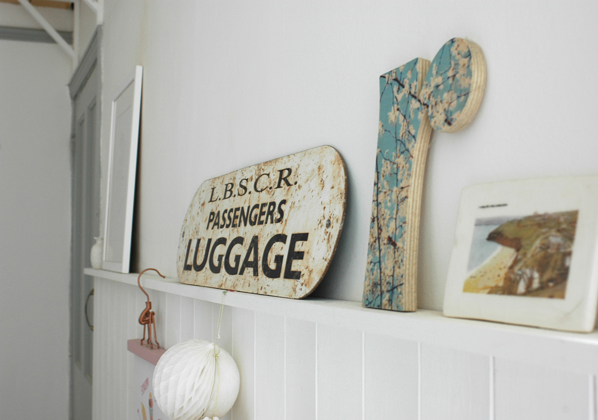
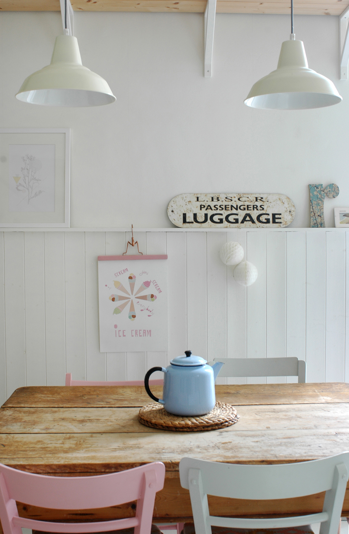
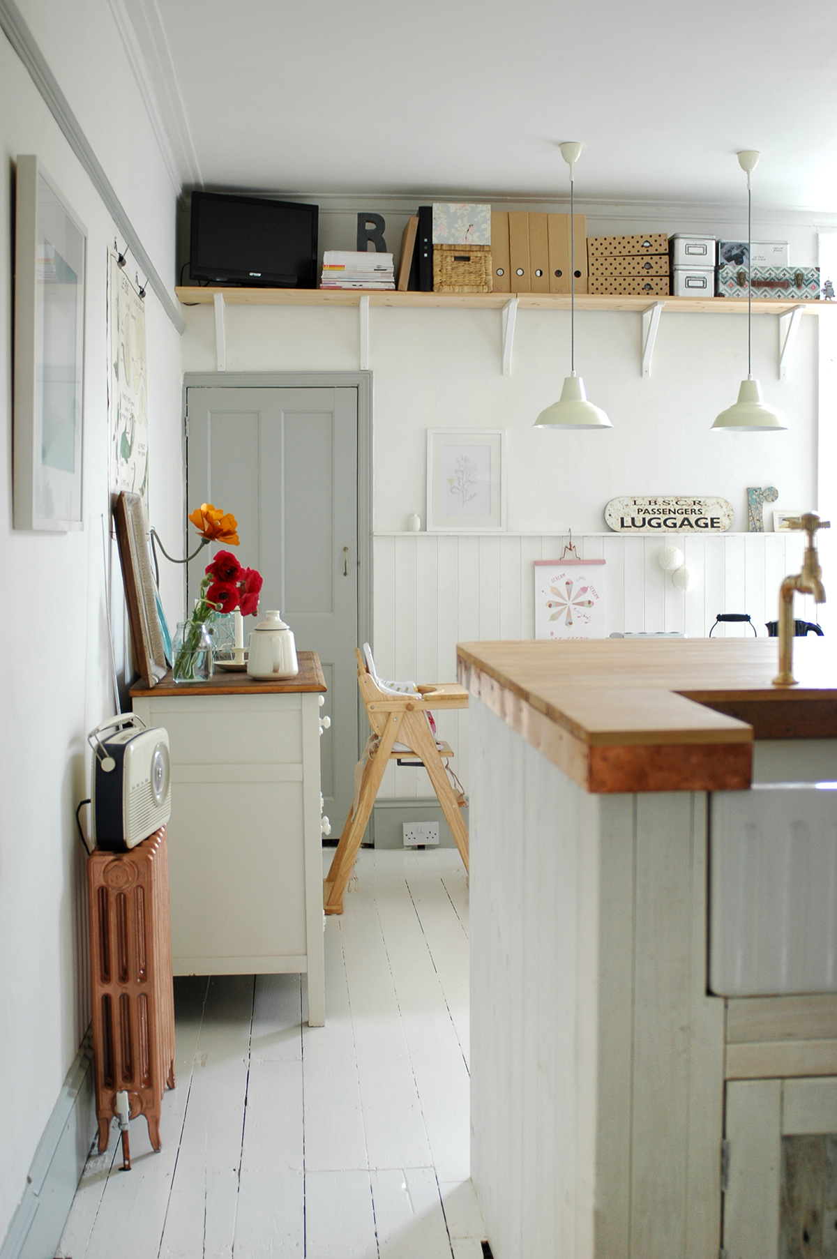
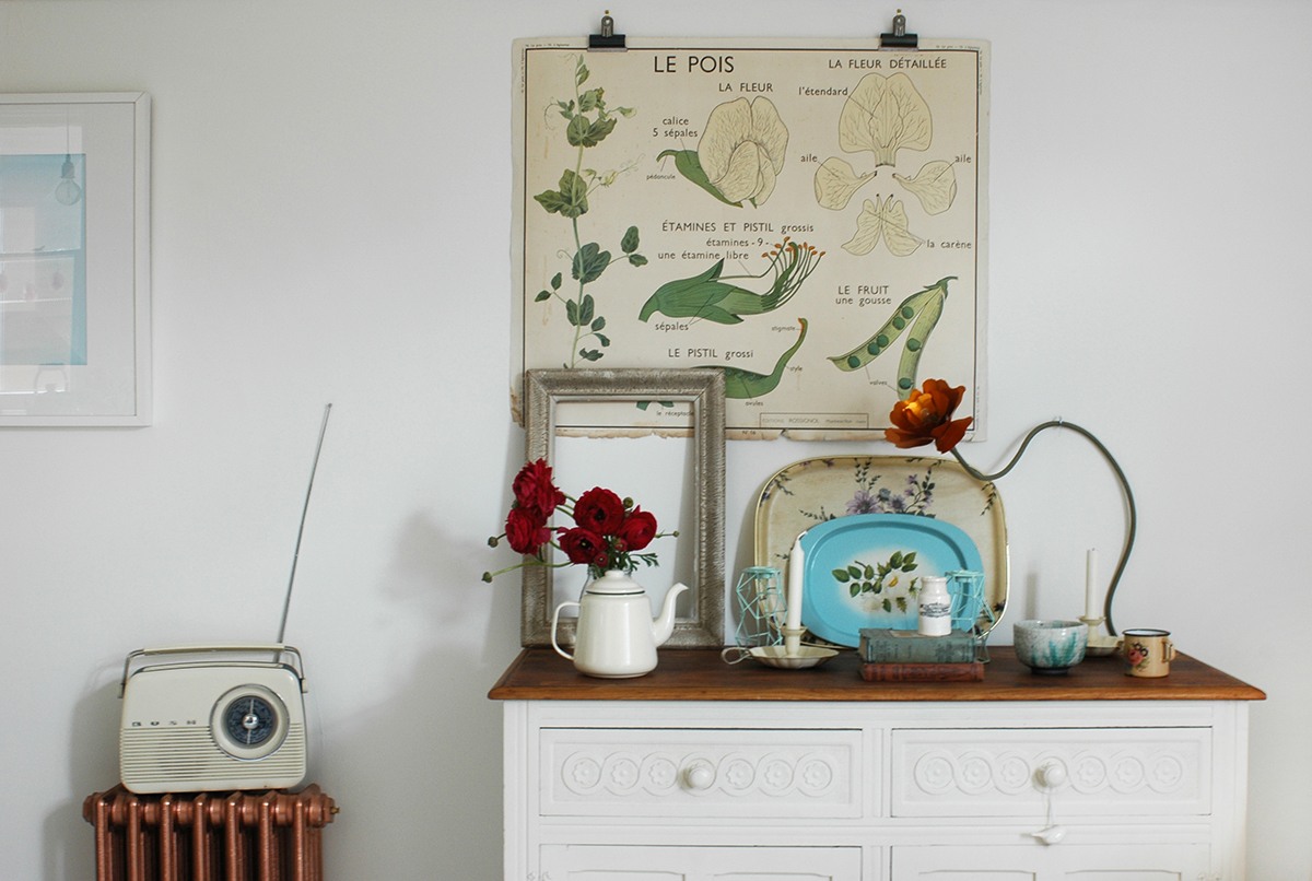
We have just recently sold our lovely little home! I'm really sad to be moving on from this flat - our first home we've owned together, the inspiration for 91 Magazine's name (91 is our house number) and where we brought our first baby back to a week after she was born. So many great memories and also the first place I've really been able to put my stamp on in terms of the interior. I think I'll be especially sad to leave our kitchen behind, as I love it and put so much effort into it. But hey, it's time to move on and give our family more space to grow.
our kitchen/dining room - Photo by Cathy Pyle

our kitchen/dining room - Photo by Cathy Pyle

We have just had an offer accepted on an amazing house but of course you can never celebrate until contracts are exchanged, but it doesn't stop me from dreaming about what I will do to the place! I'm definitely feeling that I want to continue the kind of look we have in the kitchen now - a white backdrop with lots of dashes of pastel and bright colour. My heart is still with white painted floorboards, but I'm also really liking polished concrete flooring and I love parquet too.
I thought I'd gather images of some of my favourite homes which I've lusted over for a long time, many of them belong to bloggers who I really admire., and whose homes I will be taking lots of inspiration from for our new place. 

Images via Zilverblauw website or Instagram

Images via Zilverblauw website or Instagram

This is the home of Zilverblauw owners Anki and Casper. I actually wrote a home tour feature about them for Mollie Makes a while back, and totally fell in love with their style. Their Instagram account is a must follow. 

I've loved Yvonne of Yvestown's home for a very long time, and I never seem to tire of it. It's so fresh and I love the colour and pattern she has introduced. These images were taken by Holly Marder for her Homes with Heart column on Decor8. In fact, her column has given me lots of inspiration and some of the other homes here were found via her posts. 

I love a feature wallpaper wall like Yvonne has above, so I am keeping my eyes peeled for some great designs. I love this pattern, designed by Josef Frank available from Svenkstenn.

Image via Svensktenn

Image via Svensktenn

Below is another home which I had the honour of writing about for Mollie Makes. It is owned by Marie of Oh Marie. These shots were by Holly Marder again and you can view the whole set on Decor8. I love that statement rug and how she has injected colour by painting furniture in vibrant shades. I love the white brick walls too, but I imagine we'd be very lucky to find those in any houses around Surrey! 

Holly Marder also snapped this stunning home in The Netherlands for her Decor8 column. (more pics via the link) Contemporary design mixed with vintage finds and upcycled furniture. Perfect. 

Finally, two more bloggers whose homes I'm obsessed with - Ingrid of Fjeldborg in Norway (images courtesy of her blog)

and another Ingrid - this time of Wood and Wool Stool in The Netherlands. These images were also shot by Holly Marder - more on Decor8. 

I love the introduction of grey on the walls in both these homes, and of course their amazing furniture! Oh and the floor in the last two images. I could forfeit my white floors for this I think! 

Wow, this turned into quite a long post! You can tell my mind is in full 'new home: so many possibilities' mode! I will keep you updated on our progress! :) 

Creating a timeless interior

So this week I was asked by Carpetright to be their 'interior advocate' for the launch of their new range of flooring in collaboration with House Beautiful. I do love a collaboration, so think it's great that these two brands have come together to combine their expertise.

I was asked to share my thoughts on creating a timeless interior, and actually this is something I'm thinking about a lot recently, as we are in the process of (hopefully) buying a new house. We hope it is somewhere we will stay for quite a few years, so I want to make the right decisions at the start in terms of decor, so that it will be long-lasting in terms of style, and will just need minor updates now and then. 

For me I think the best way to start is with a neutral backdrop. White, grey or pale colours on the wall, which you can then add to with art, accessories and perhaps the odd piece of brightly coloured furniture if you want to create a statement - just make sure you really love that statement, otherwise you might grow tired of it quickly! 

Period features are another way to have enduring style, as long as you maintain them and accentuate them. Look at the windows, radiators and panelling in the above shot, so lovely. Even if you aren't lucky enough to have original features, you can always replicate some of them in your home. Perhaps add deep skirting boards, if the height of your room can take it, or there are lots of great cast iron radiators around - we got some for our kitchen/dining room, which we sprayed copper. 

Of course flooring has a huge impact on the overall look of a room, so make sure you really think about what you can live with, what is practical for your situation and of course what you can afford - as it can become costly. I love this image above, which would you believe is vinyl flooring! At first I thought it was concrete, which I'm massively into at the minute. 

Earths core quartz_08b-1537109rt_retouch.jpg

While we might not all be lucky enough to have these huge windows, we can bring a little nature into the home via indoor plants and flowers. These will never go out of fashion, so make sure to always have some greenery in your space, whether it's an easy to care for group of cacti, or a pretty posy of flowers on the kitchen table. 

I'd love to hear your thoughts and tips on enduring, timeless style. I really want to achieve this in our new home! Oh and by the way, if any of these images have inspired you to put down some new flooring, Carpetright are running a competition to win £700 worth of vouchers as well as some other goodies. You can enter here.

Living stylishly with kids

When I recently received an email about a new book called Design Mom: How to live with kids, a room-by-room guide, it really resonated with me. When you care a lot about how your home looks, it's a natural worry to wonder how all of the paraphernalia that comes with children will fit into your decor. Ruby is still young, so she doesn't have too much stuff just yet. I currently use boxes and baskets just to throw all of her toys into once she's gone to bed, but I'm sure this will change as she gets older and wants more things. 

designmom.jpg

So this book by Gabrielle Stanley Blair, grabbed my interest. The book is full of lovely interior images that show you how to still have a lovely home with kids in the mix. It's broken down into bite size chunks; perfect for us mums who don't have extended periods of time to read - we can pick it up when we've got five minutes! Tips such as 'shoe storage is your best friend' and 'furniture that moves as quickly as your kids' will probably ring true with some of you. It also has some easy DIY projects thrown in which is really nice. 

These are a few of my favourite images from the book to give you a taster. I love how there are clearly children living in these homes, but the owners have made it part of the space, rather than trying to hide it all away. It really is a lovely book that is practical as well as pretty. I'm sure I'll be referring to it for years to come! 

Photo credits: 1: Caroline Rowland / 2: Caroline Coehorst / 3: Meta Coleman / 4: the Land of Nod / 5: Anna Napthali / 6: Meta Coleman / 7: Heather Zweig, with stylist Jordan Ferney

Design Mom: How to Live with Kids: A Room-by-Room Guide by Gabrielle Stanley Blair (Artisan Books). Copyright © 2015 Buy it now mums and dads

kitchen renovation tour

Following on from my last post about our DIY kitchen worktop, I thought I'd share some more images of the kitchen renovation we've done over the last year. I'm so happy with the space now, so I'm quite sad that we are going to have to sell later this year. :( 

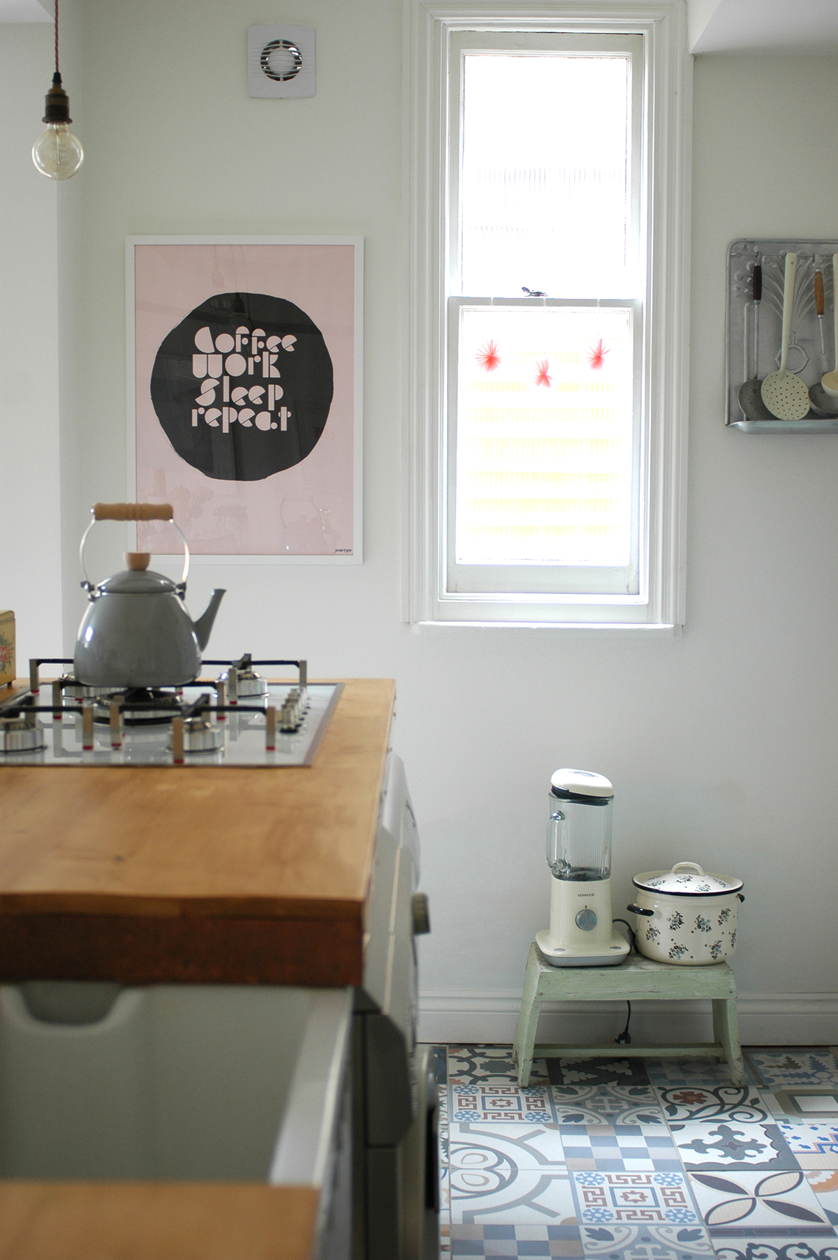
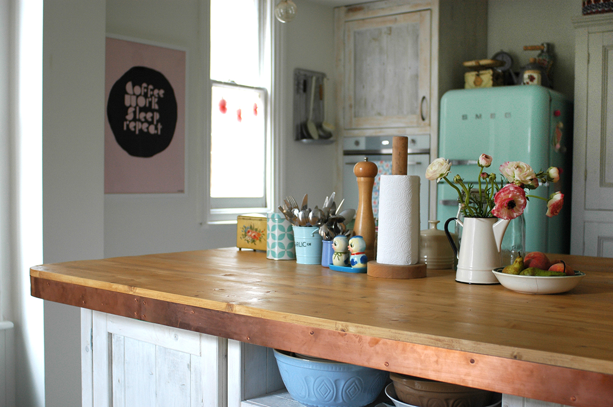
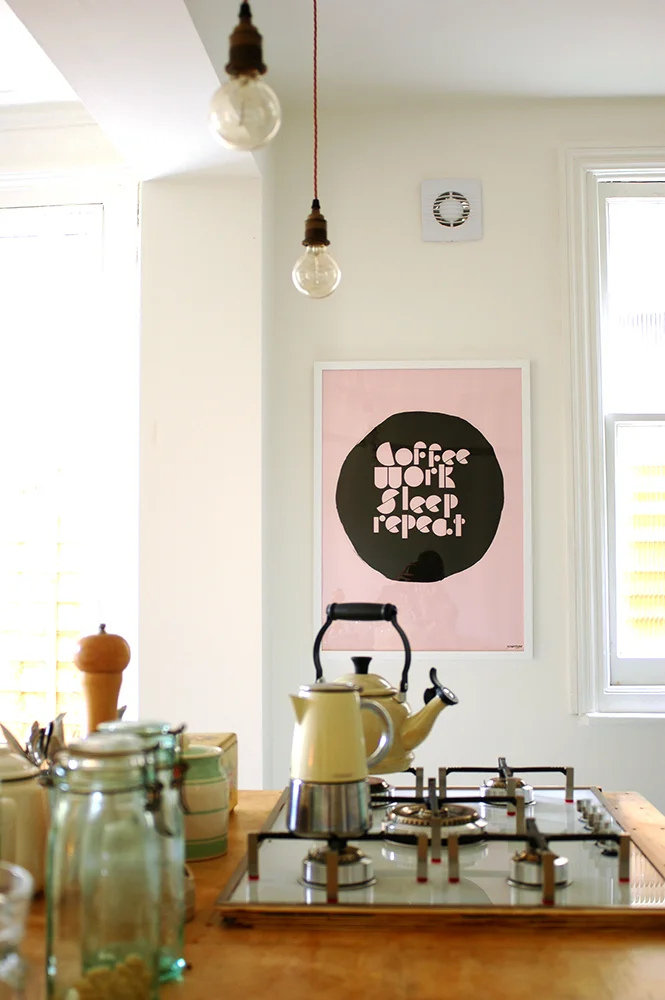
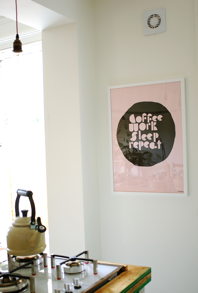
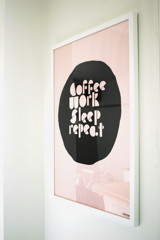
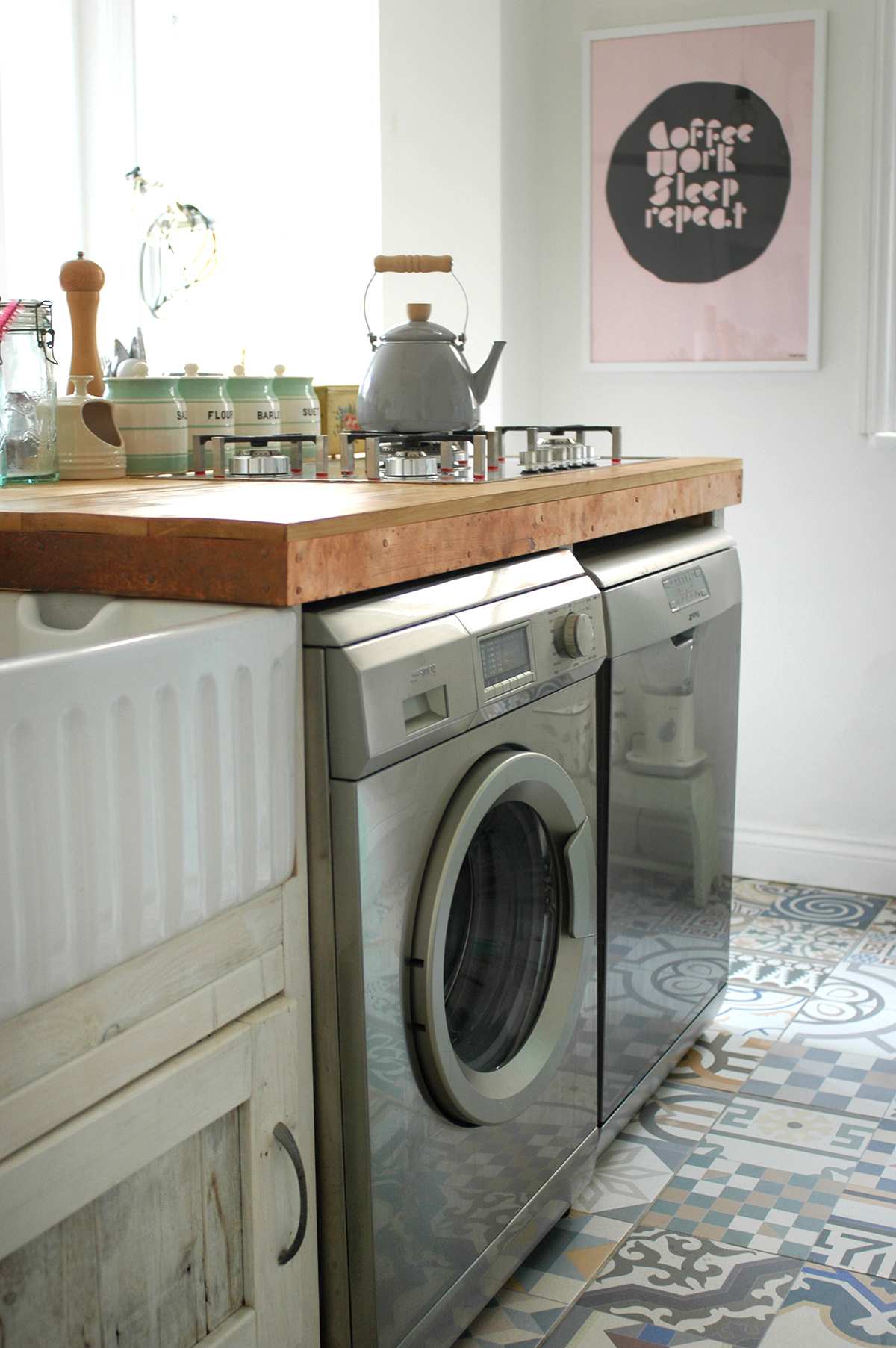
Annoyingly I can't find any decent shots of what we had before, but basically it was a small kitchen and a separate dining room which we never really used that often, apart from sometimes in the summer as it opens into the garden. So the main thing we did was knock through the wall between the two rooms. We had to get steel beams installed, and that was probably the most costly bit. We had a back door in the kitchen (where the pink and black print is now) so this was blocked up and then we had a raised floor created for the kitchen area. As I mentioned in the worktop post, I designed the kitchen island myself and a carpenter built it for us. Strangly while they were trying to source some reclaimed wood, it was discovered that we actually had two layers of floorboards in the dining room! So they ended up using the top layer to construct the island, saving us quite a bit of cash! We then white washed all of the wood for a bit of a rustic feel.

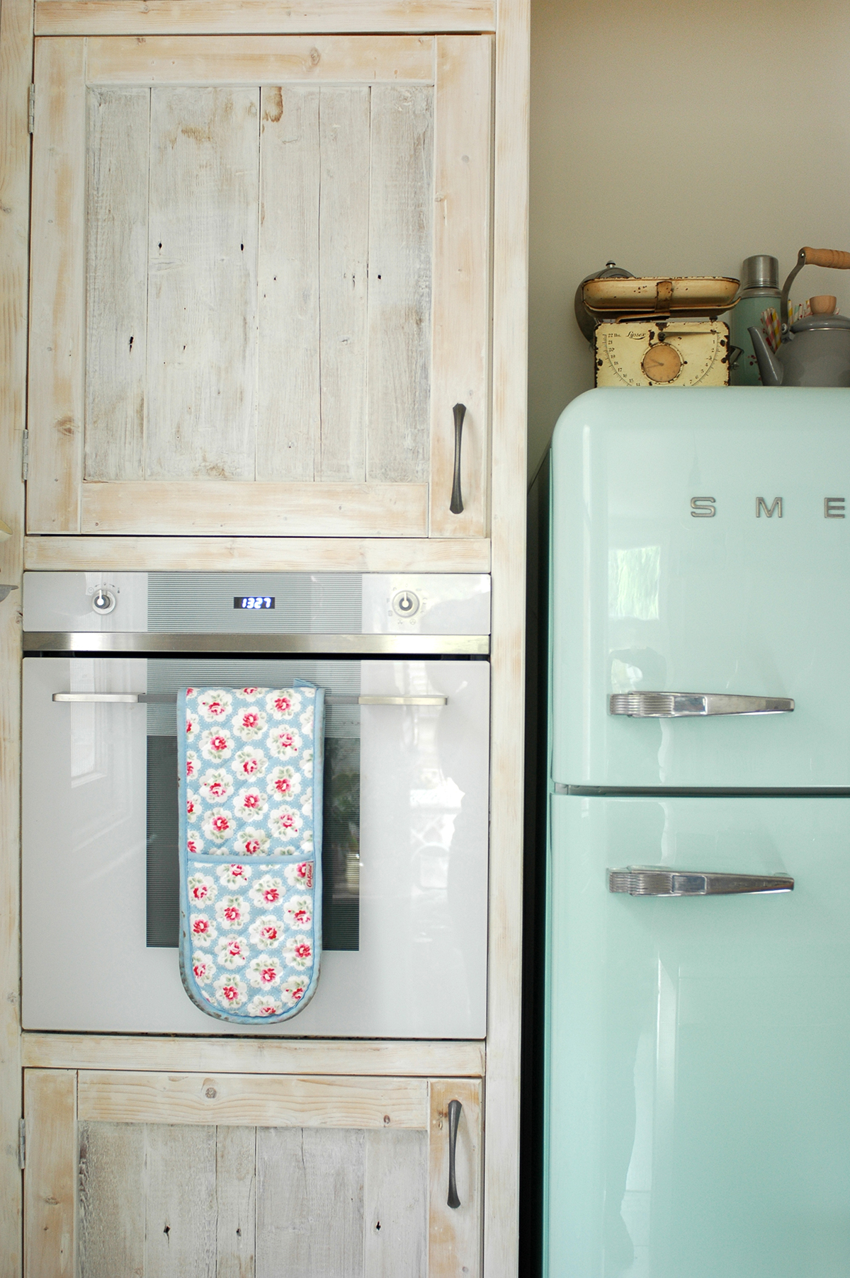
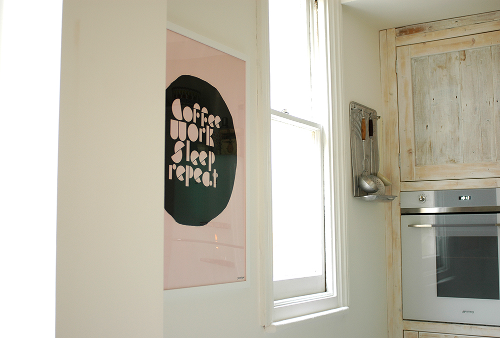
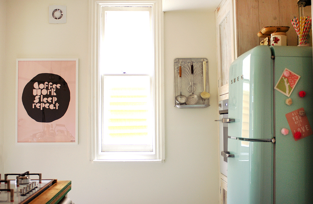
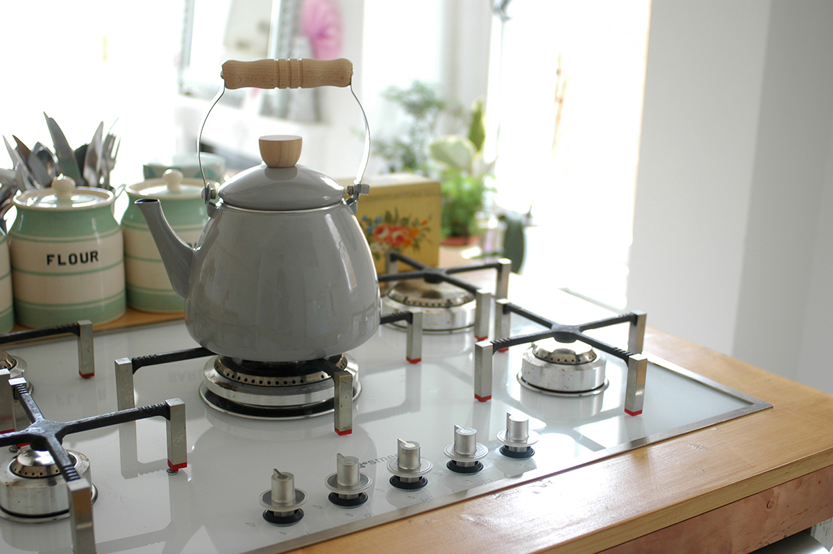
It was my dream to have a Smeg fridge ever since we bought this house, so I was super happy the day it arrived! We also had a Smeg hob and built in oven installed, as well as a Smeg dishwasher and washing machine which are tucked in the other side of the island, opposite the fridge. I wanted the lighting to be really simple in the kitchen so we just hung three bare bulbs from fabric covered cable above the island. The freestanding vintage larder I bought from lovely Paul and Sarah of Goose Home and Garden - it is so perfect for all our store cupboard foods, and the lower part has all my china, cake stands and things like tea towels and baking items. 

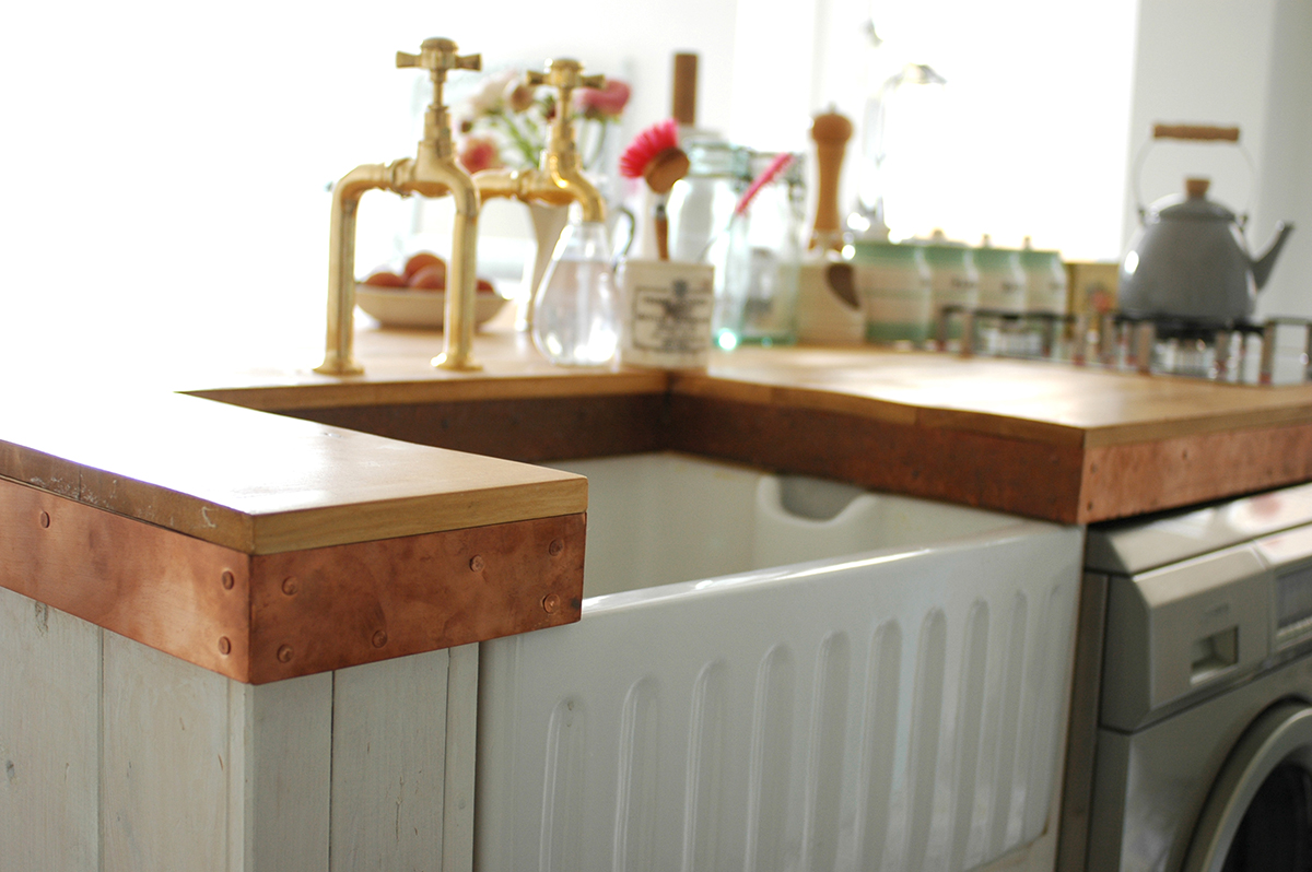
The tiles in the kitchen are were sourced from Armatile. I really loved the idea of encaustic tiles, but original ones were expensive and hard to look after, so these were a perfect alternative, and I love the patchwork look. The Belfast sink I bought online from TapsUK and I sourced the gold taps from a small bathroom supplies company called Colton bathroom supplies.

I found the vintage school science lab stools on eBay. They were a real bargain, at £25 each! I love how they have got graffiti scratched into the wood! 

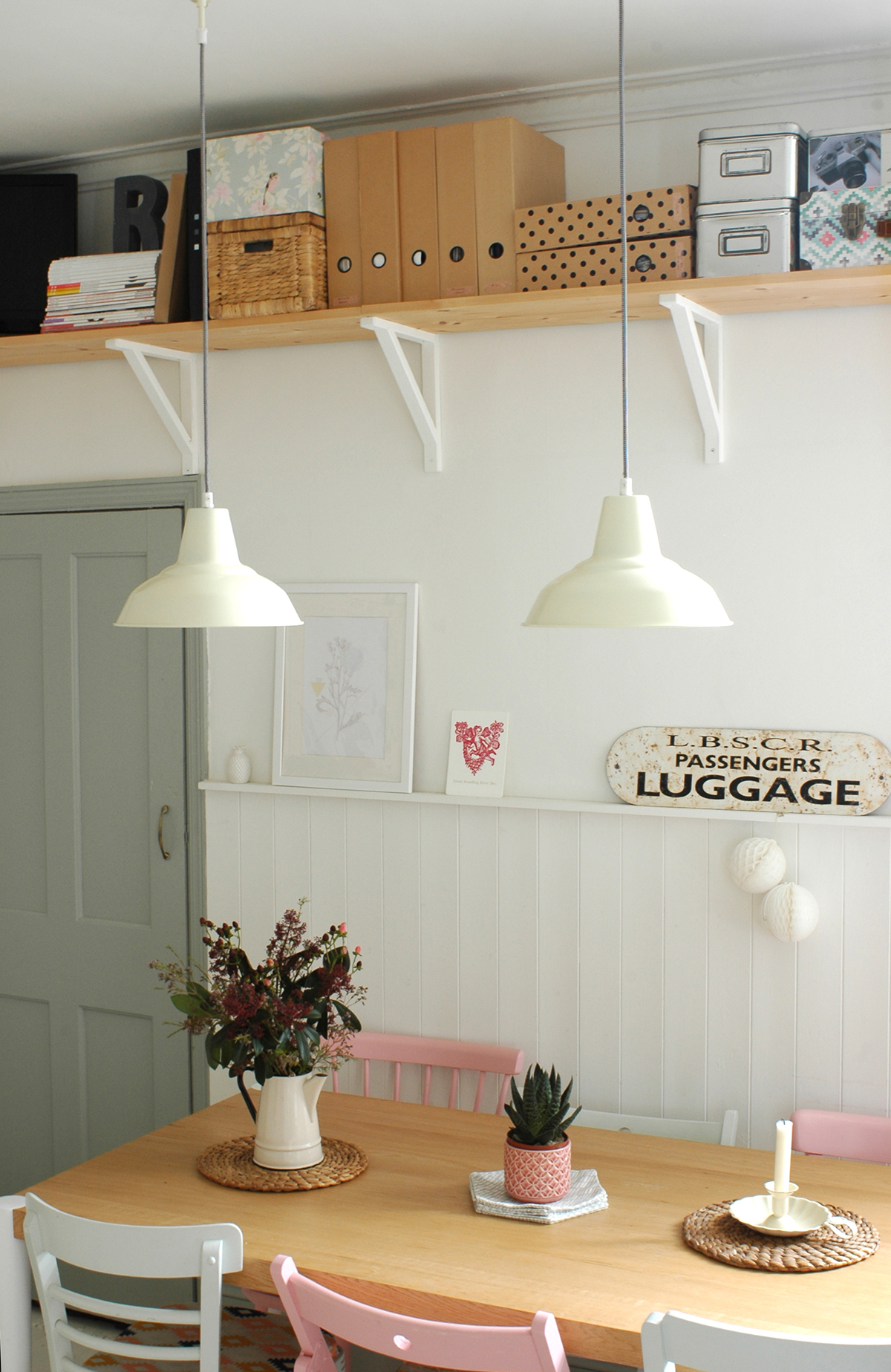
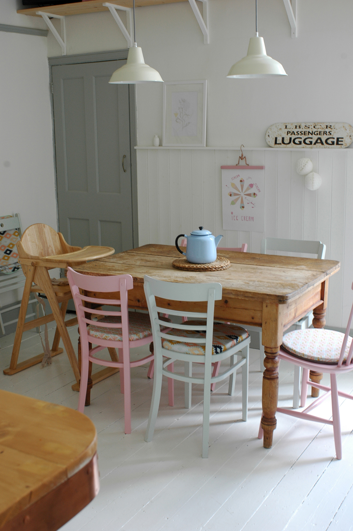
In the dining area there were no big structural changes, but we added some tongue and groove cladding to the wall and adding some shelving to help solve storage problems, and then painted the floor in Farrow and Ball Wimborne White floor paint. We actually have a new dining table since I took these photos which you can see here on Instagram which came from made.com. The pendant lights are from John Lewis.

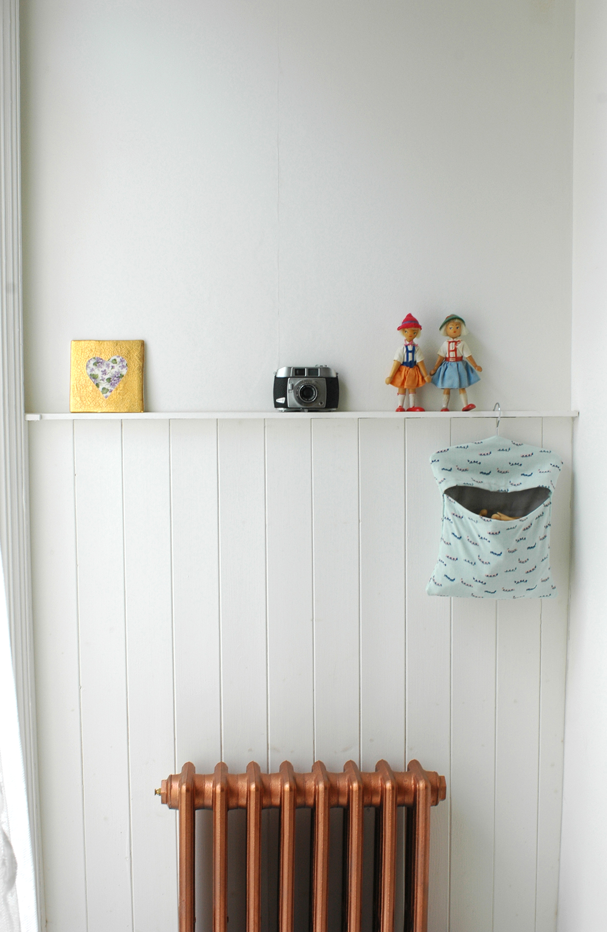
We put in new radiators as the original one was on the wall which was removed. They came from Period House Store. I just ordered the ones that came with primer on, and then I spray painted them in Plastikote Metallic Copper. The sideboard was another eBay find.

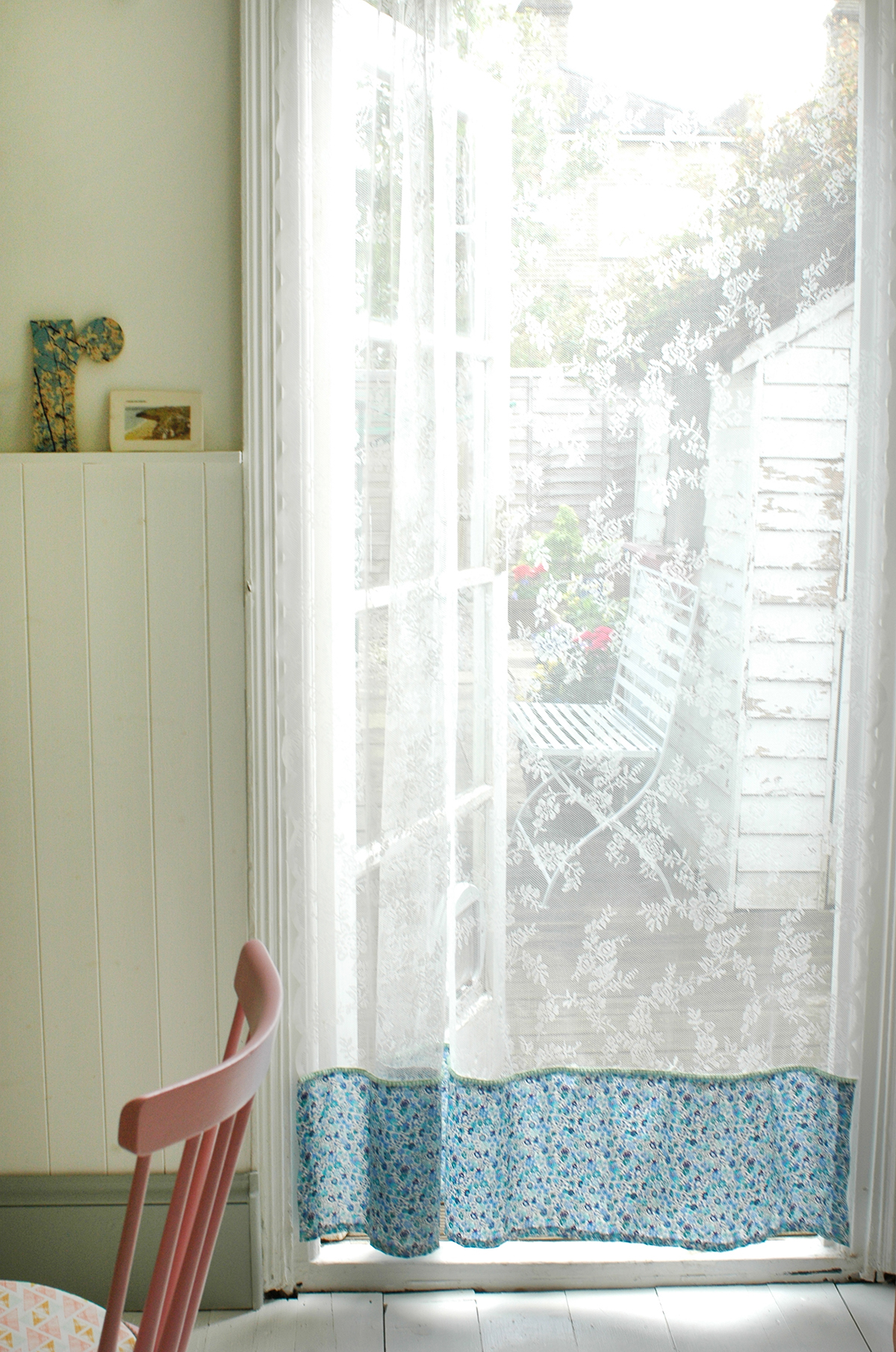
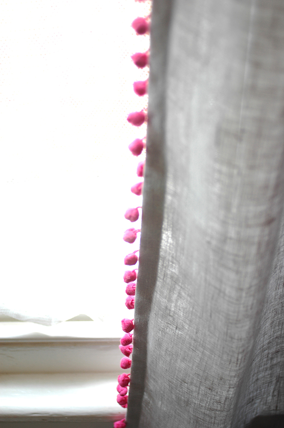
I had to have some handmade details in there too, so the dining chair seat covers were made by me, and I also customised the Ikea net curtain, by adding a little bit of Liberty fabric and some pom pom trim to the bottom edge.

And that is pretty much it! Apart from the main building work we really did try to do this on a tight budget, mainly through doing a lot of things ourselves, like decorating, making the worktop, painting radiators etc. I did use some of my industry contacts to get some discounts for things, but I was also super savvy when it came to sourcing fixtures and fittings. All it takes is a little bit of time researching online to find the best deal. 

Anyway, I'd love to hear what you think, and if you have any questions just let me know! ;) 

xxx

DIY: Kitchen island worktop

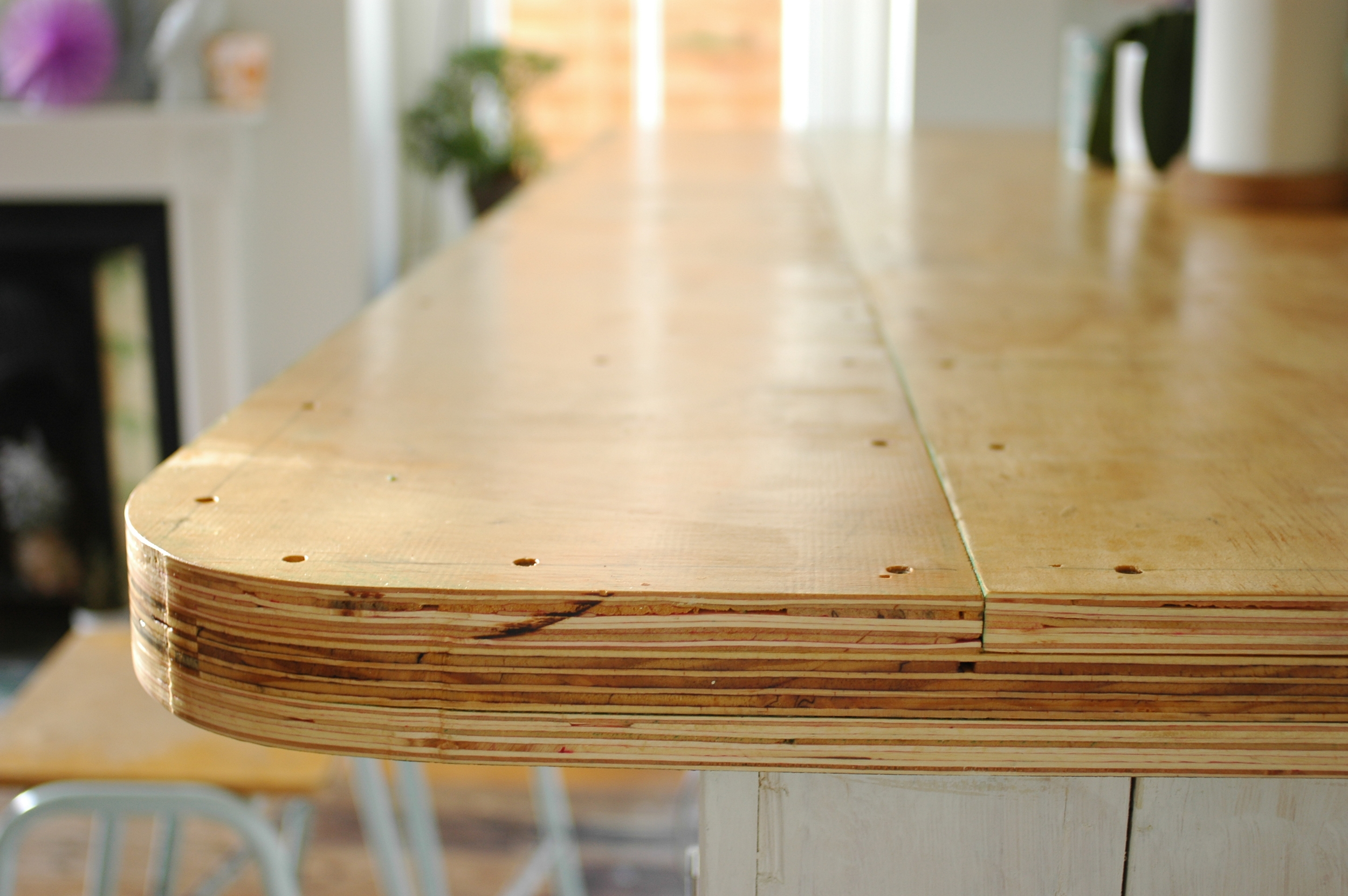
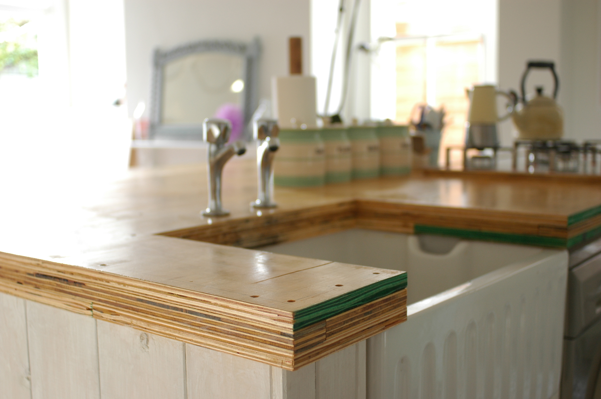
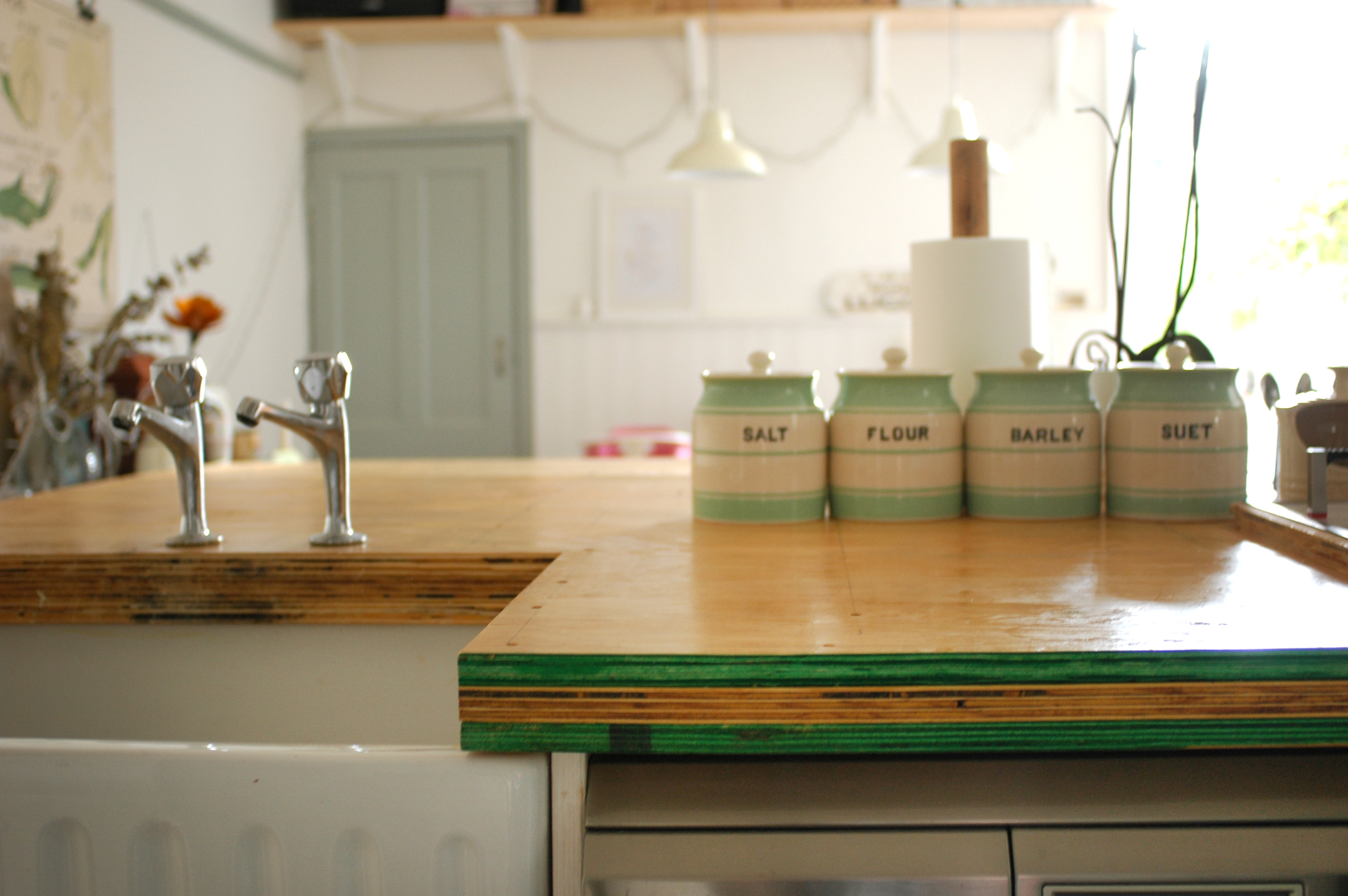
If you are regular reader or follow me on Instagram, you will more than likely know about our kitchen renovation that we've been doing over the last year. (yeah, it's really taken that long to finish!) This was my original moodboard post. It is finally finished now, and one of the major challenges we faced was the kitchen island worktop. The initial plan was to have it clad in copper - this wasn't a cheap option but something that I was really keen on. This all fell through when the company went awol, then our builders offered to do it, but then they went awol too. They left us with a plywood worktop which, while I actually quite like plywood at the minute, it just looked really rough and unfinished. They also left us with temporary taps as they hadn't yet fitted our new ones and I hated them! The cheapest of the cheap taps that kept twisting round when you turned them! 

We decided we needed to find an alternative to a copper worktop as really it was just a bit expensive. For a while we toyed with the idea of concrete, which I blogged about here. We thought about doing it ourselves, but then concluded that it was just a little too daunting and we might make a real mess of it! So we got a quote from a company to do it, but this was just as expensive as the copper. So we were back at square one. In the end, we decided to go for a simple DIY idea, that would finish off the worktop but not cost a fortune. 

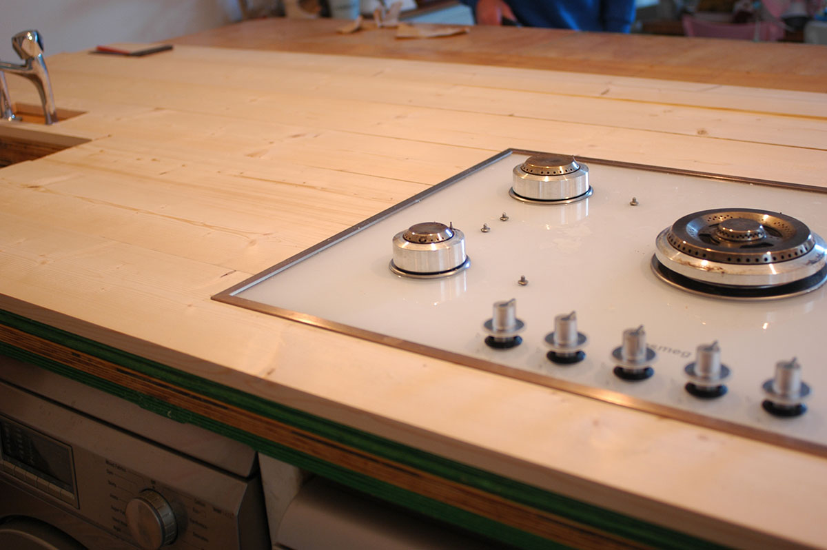
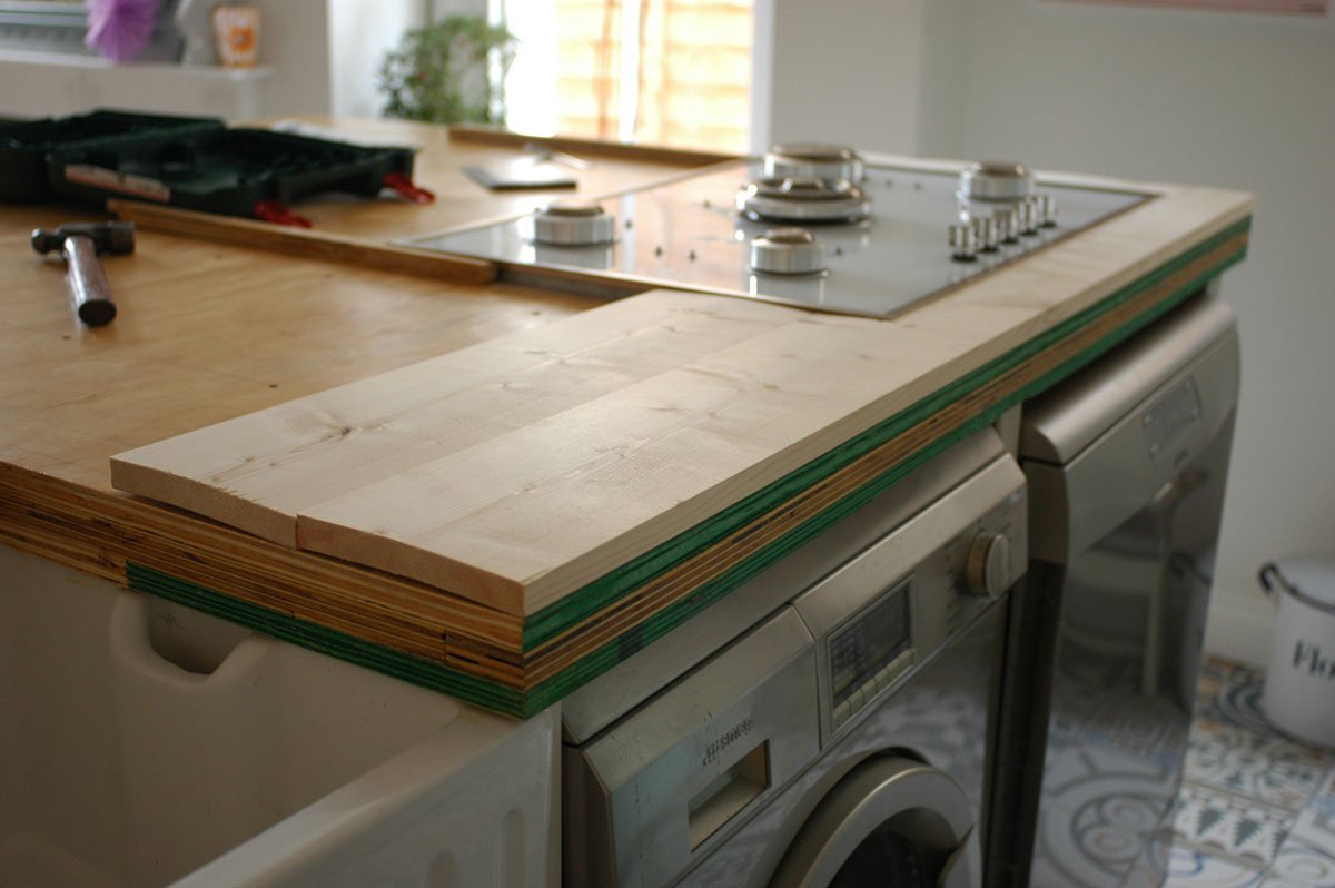
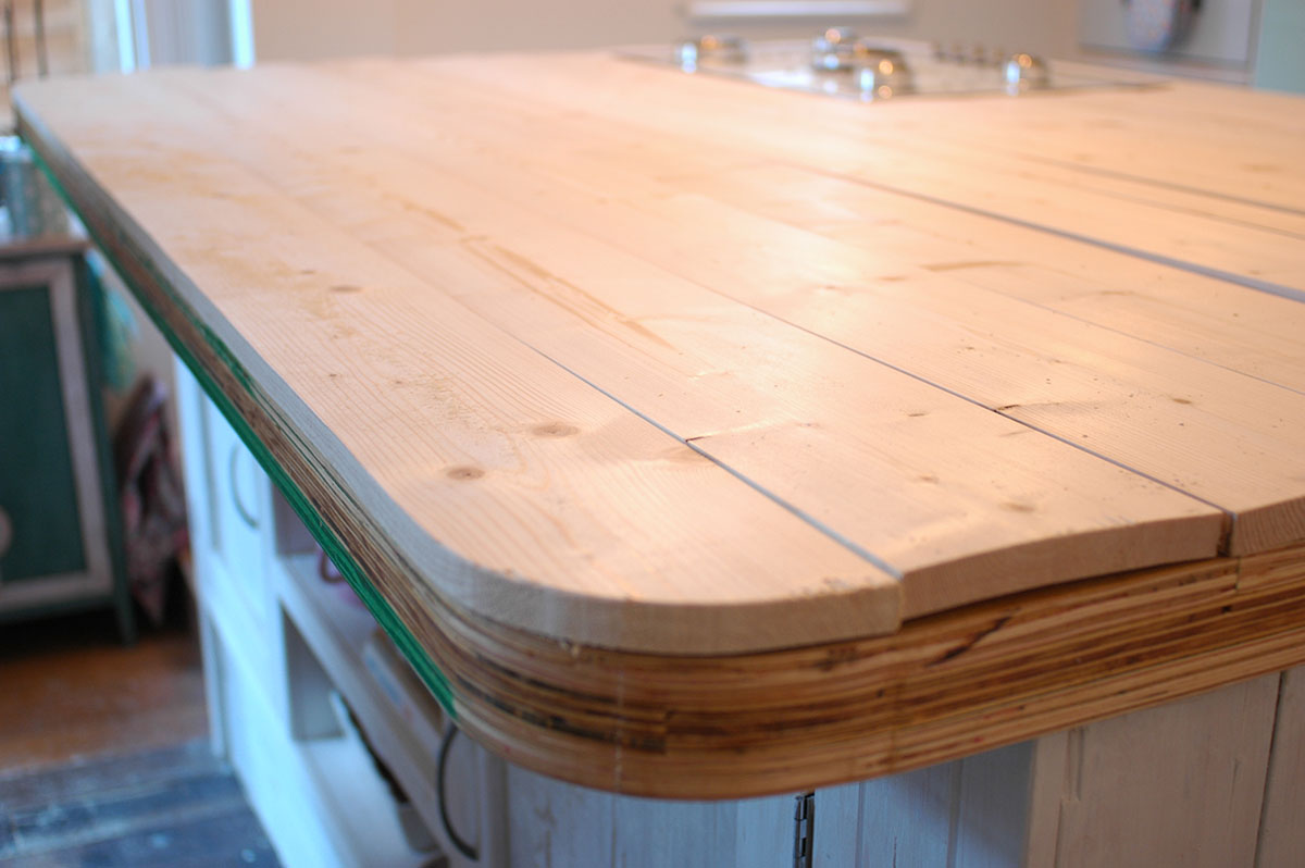
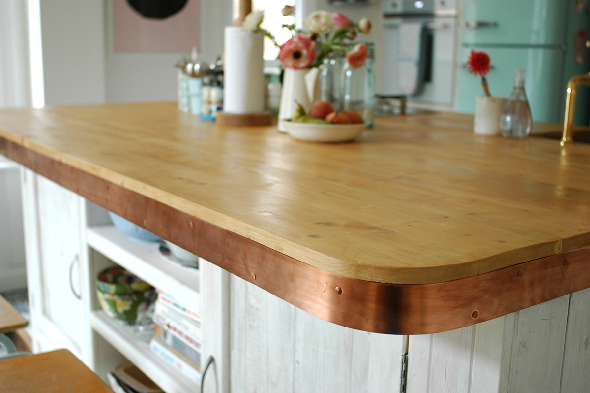
We bought some wooden planks, and simply screwed these on top of the plywood. Thankfully this meant that the hob was now flush to the worktop. (The builders has left it slightly raised up above the plywood for some reason)

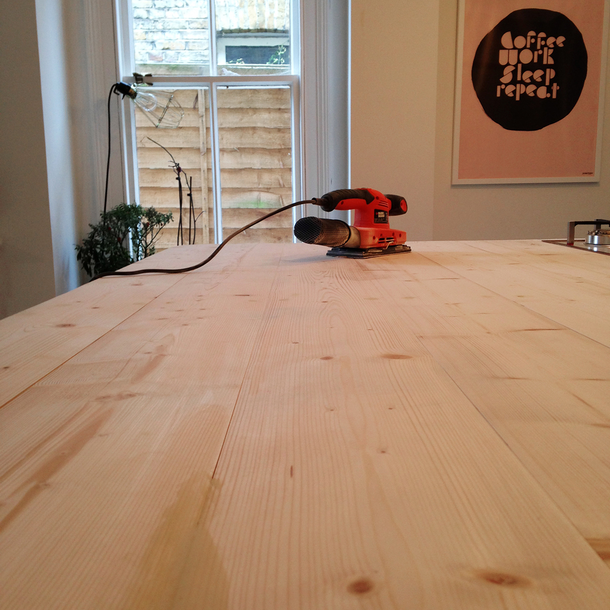
This was then all sanded down, and the screw holes and any gaps were filled with wood filler. We then stained and varnished the wood. The final issue was how to cover the edge of the plywood. We went back to the original idea of copper, and bought copper strips and copper nails online and used these around the edge.  

Ta da! This is the finished result! Oh and we fitted the taps ourselves! I think it turned out really well and was a much cheaper alternative. The great thing about copper is that it ages well, so even around the sink where it gets wet, the oxidation and patina just adds to what i hope is a kind of modern rustic look.

It cost us approx. £400 for the materials - the wooden planks, stain, varnish, copper strips and nails. And nothing else but a bit of our time and hard graft. Compared to the quotes of between £1000-£2000 for the copper or concrete worktops, it has certainly proved a more affordable option. It might not be quite as impressive as either of those, but hey, when you're on a tight budget, you often have to compromise. I'd love to hear what you think! x

Current Obsession: mid century furniture

I feel like my interior style has been changing a little of late. I've found myself drawn more and more to Scandinavian interiors - quite minimal and lots of white. Not only this, my preference for mid century furniture design seems to be growing.

via bykiki.se

We are actually planning to sell our house soon, which is an Edwardian maisonette, and we are seriously considering going for a more modern property, probably something built between 1950-1980. This seems like the perfect opportunity to go for a more mid century look. Of course this is likely to mean spending more on furniture, as it won't be so easy to pick up pieces from car boots and markets for next to nothing like i have done for our current home. And while it would be lovely to have original pieces by the likes of Charles and Ray Eames or Hans Wegner, the chances of that are unlikely with our budget, so I was quite interested to hear about a UK based website selling replica designs called voga.com

They recently sent me some info about interior trends for S/S 2015, and the ones I am loving are the continuation of pastel shades as well as bright yellow. So I've been looking out for inspiration combining these trends with my new obsession for mid century! Lots of ideas for our future home! 

via Decor8

via Decor8

Voga is definitely worth a peek if you are a fan of mid century furniture but are on a tight budget. For example they do a version of the Hans Wegner Y chair, and the Eames chairs come in lots of different colours....

Are you a fan of mid century furniture? Or have you found your interior style taking a new direction lately? I'd love to hear what you are in to! xxx

5 tips for a mini bedroom update

Our bedroom has been feeling a little unloved of late. We don't spend that much time in there really, apart from sleeping, and it's easy to just dump things in there or let things pile up. So at the weekend I thought it was time for a little tidy and a bit of refresh. 

I didn't do much,, but it has really made a difference! Maybe I'll even go and spend some time reading my book in there this evening.... So here are my 5 tips for a quick and easy bedroom update!

1. Buy some new bed linen

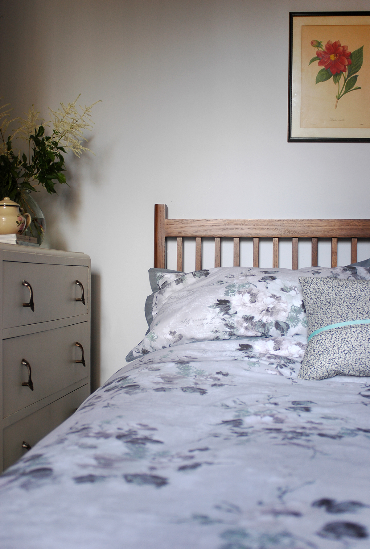
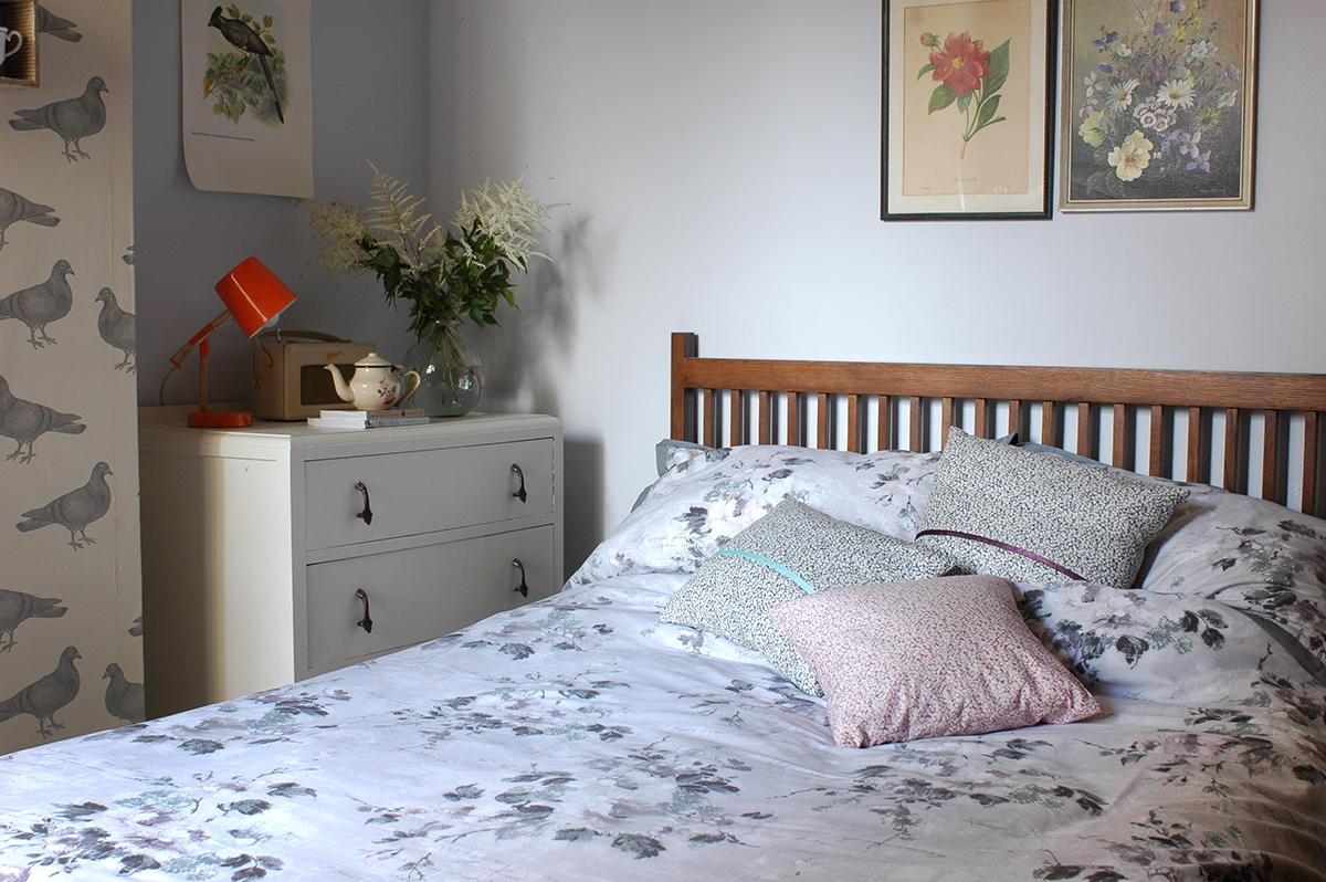
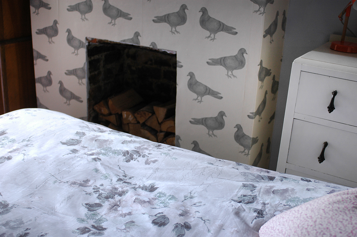
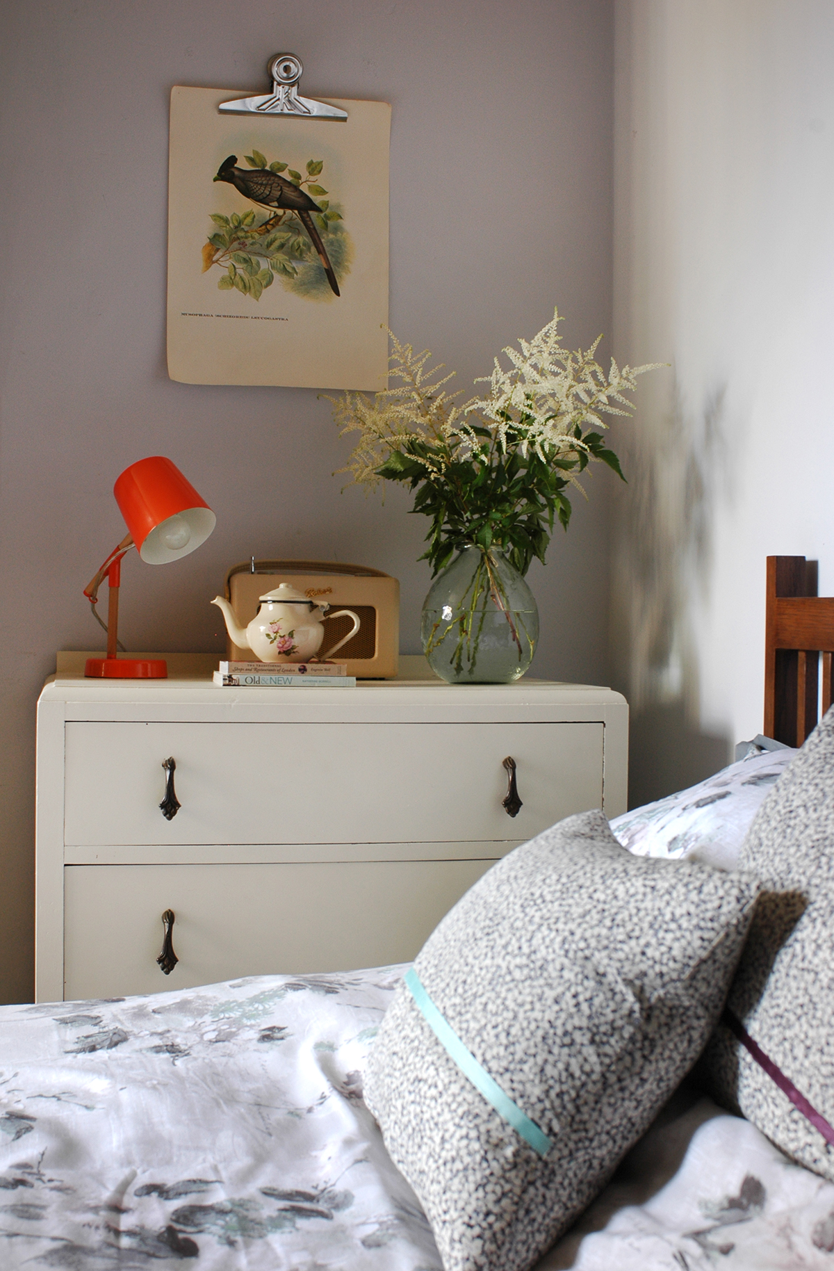
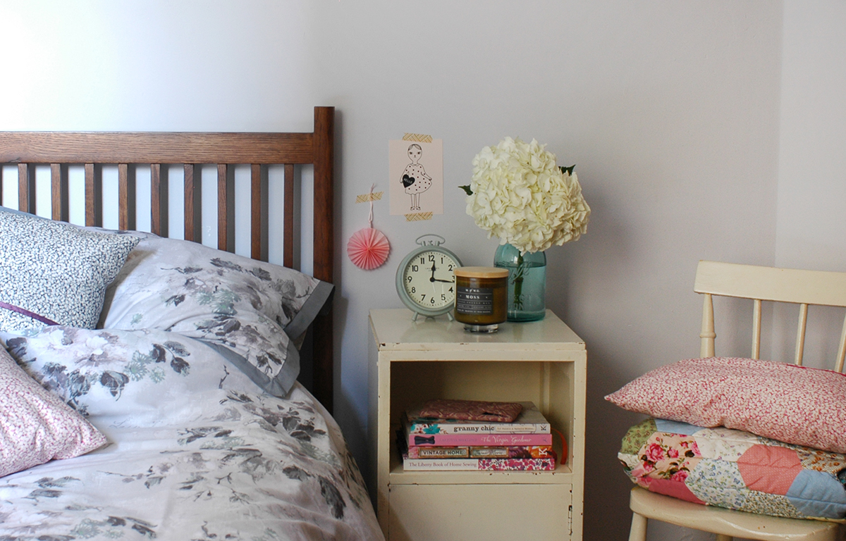
This has made the main difference in the room. We've had plain white sheets on our bed forever, and while I do like white they seem to go grey and dull so quickly, and I'm always having to replace them. So this time I opted for a patterned set which fits in really well with the other nature related elements in the room. This duvet and pillowcase set is from BHS, and a snip at £35 for the king size version. 

2. Make some new cushion covers

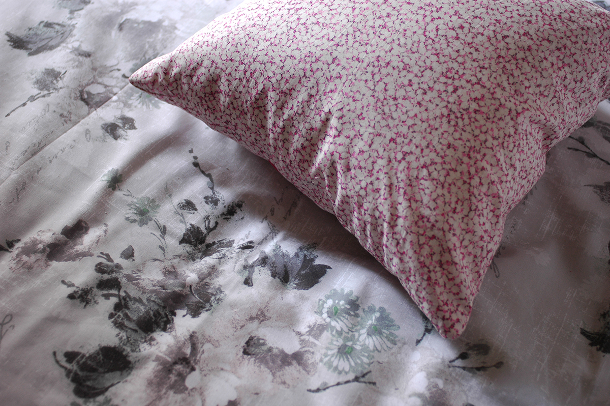
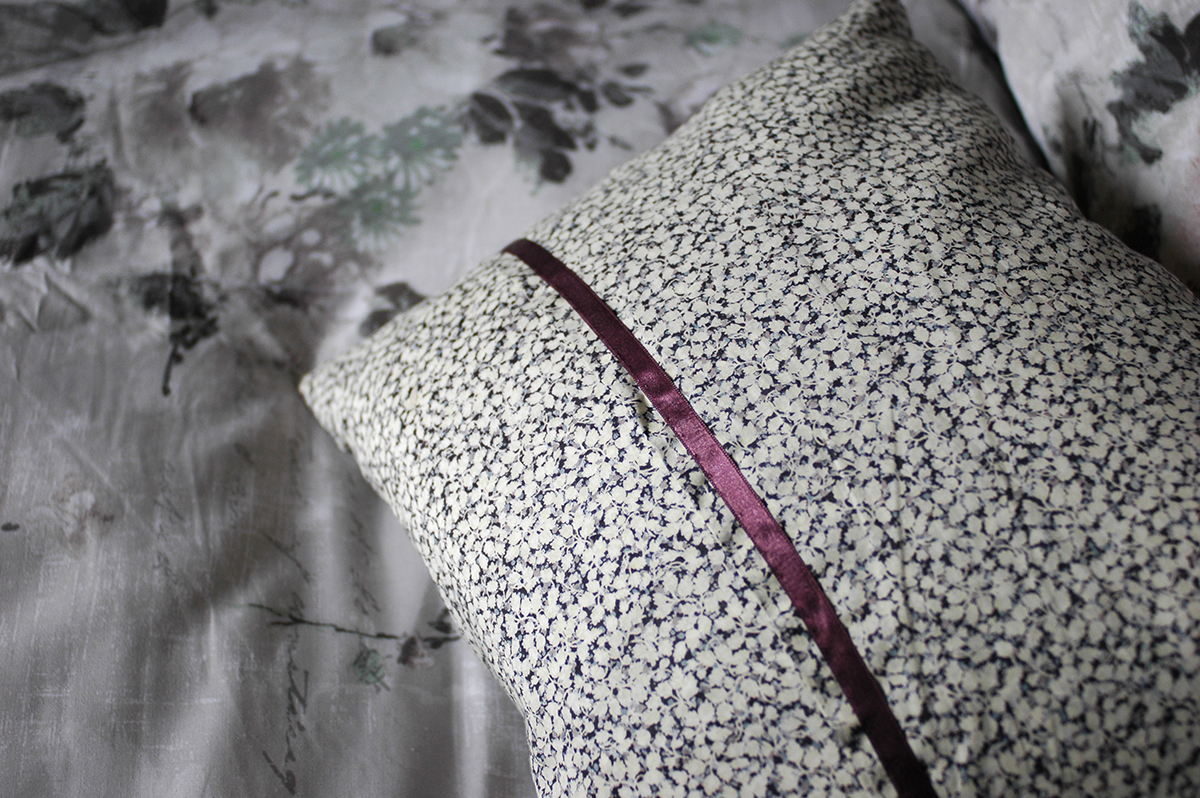
I really needed to refresh the cushions that I had on the bed, so I decided to whip up a few new covers with a bit of Liberty fabric. One of my favourite patterns is pepper, so I choose two colours in this design and used some ribbon to trim the opening. They are just super simple envelope covers, but I'm really pleased with them. 

3. Add some flowers 

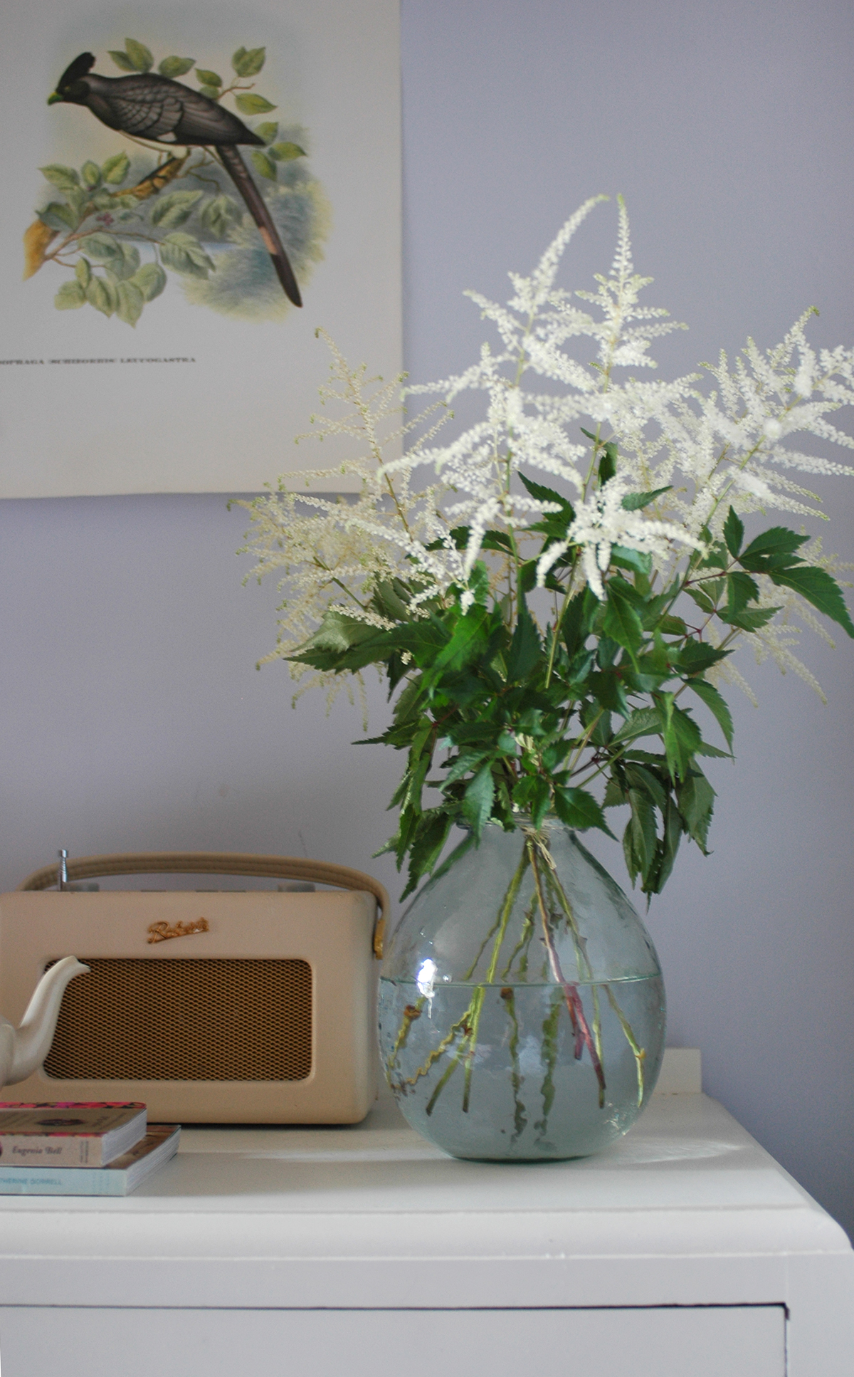
For me, displaying fresh flowers in any room makes such a difference. It may seem like a bit of an expense, but all you need is a stem or two in a bottle or vase, so rather than buying a big bunch just pop in your local florists and choose a few individual stems. Also look out in the reduced section at the supermarket, sometimes you can find a great bargain on flowers that only have one sorry looking bloom. 

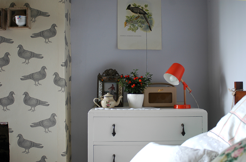
4. Restyle the bedside tables

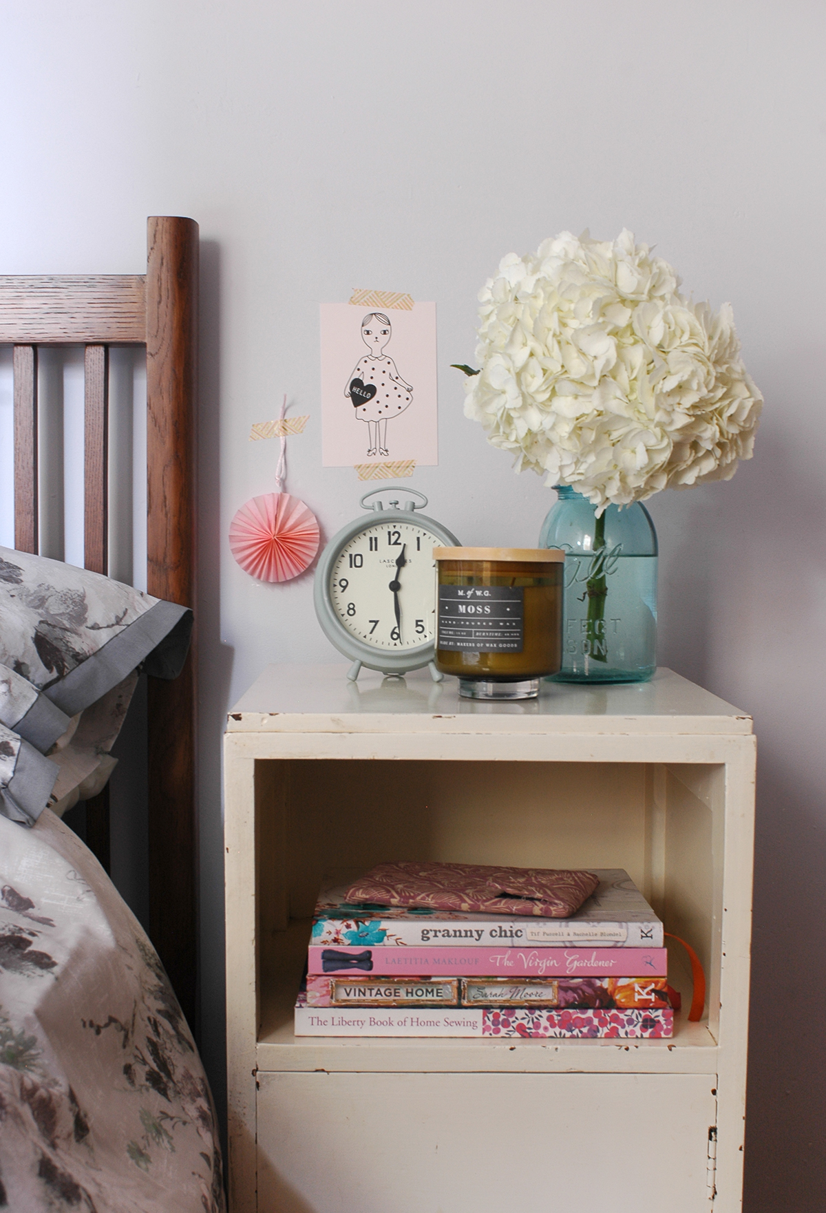
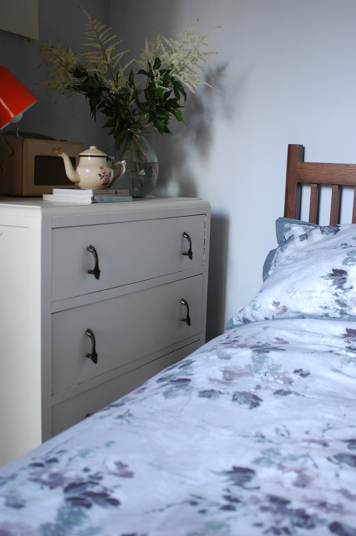
This is the area where things can sometimes accumulate: books, handcreams, coffee cups, phone chargers etc. But as this is potentially the first area you see in the morning, and the last one at night, it should be a joy to look at! Give it a little tidy up, add a scented candle or two, those beautiful flowers and maybe tape a cute postcard or favourite photograph to the wall and voila! - a simple pleasure to enjoy every day! 

5. Tidy and clear clutter

As any interiors book or magazine will tell you, the bedroom should be a tranquil, uncluttered space, so if like me, it has started to build up, just take an hour to tidy things away, and discard or put in storage anything that you don't really need or that isn't pretty. It'll make your bedroom a much nicer place to wake up in each day! 

I'm certainly feeling much happier when I go in the bedroom now! If you'd like some more inspiration for your own bedroom, check out my Bedroom Style Pinterest board too! 

Thank you to BHS for sponsoring this post, and for supplying the beautiful bed linen.

xxx

WIN a Scandi style wall stencil!

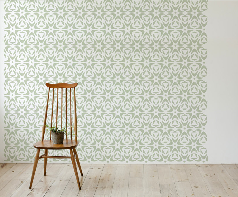
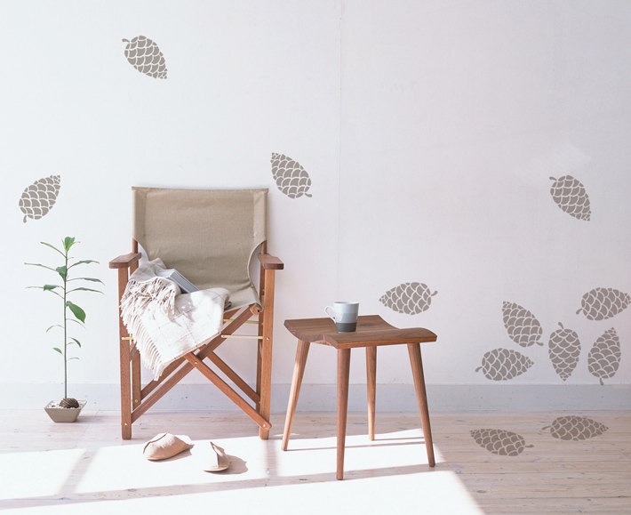
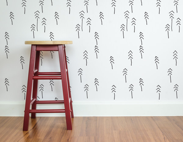
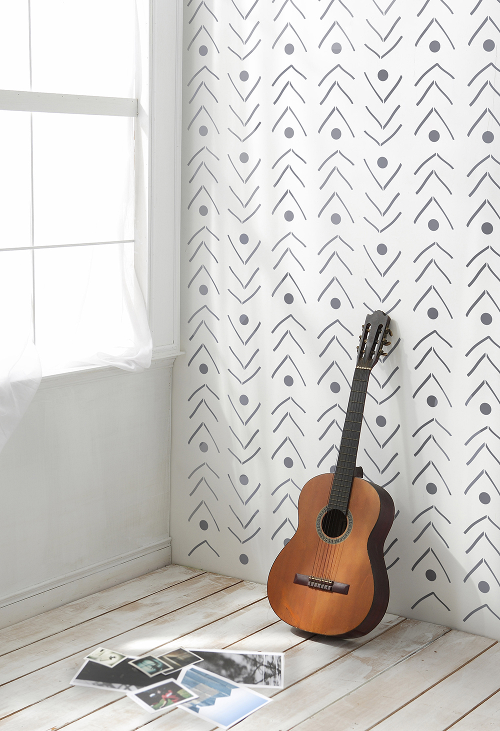
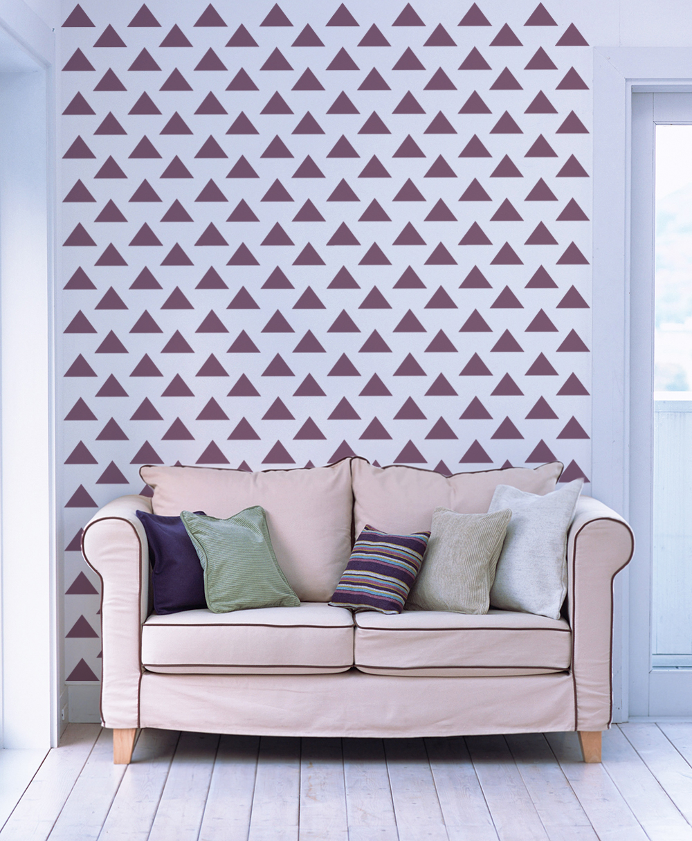
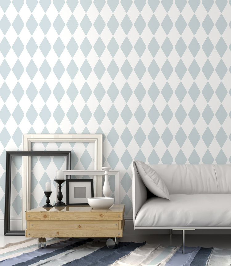
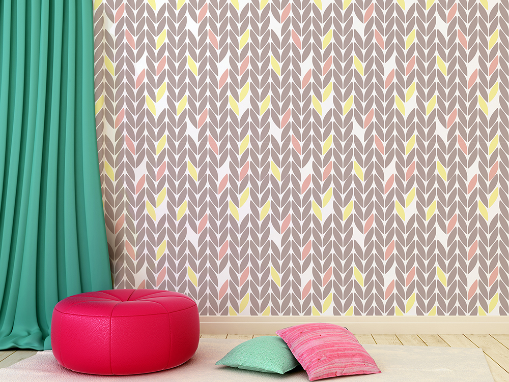
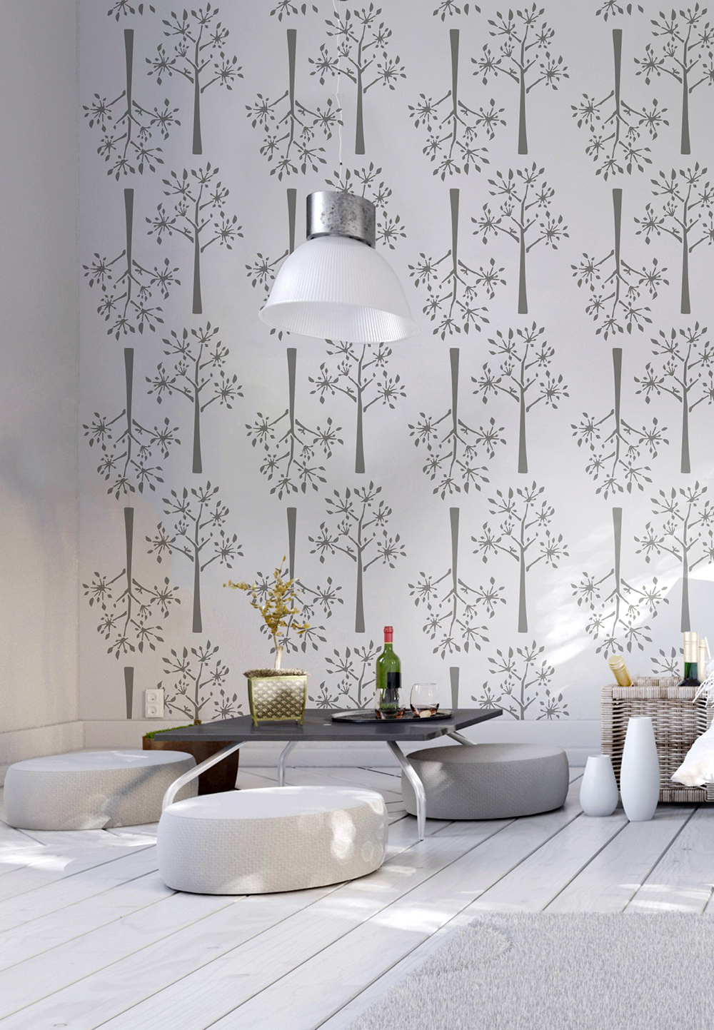
If you fancy some pattern on your walls, but find wallpaper expensive and/or daunting to put up, then what about decorating using a stencil? Stencil designs have moved on a lot in recent years and I was particularly excited to discover StenCilit on Etsy. Their designs are fresh and modern and inspired by Scandinavia.

5.jpg

StenCilit is based in Estonia, and designer Merili Sulg has a background in screen printing and wallpaper design. There are nearly 50 different designs in her Etsy store, so lots to choose from, and of course it is up to you what paint colour to use and also how to utilise the stencil. It could be to completely cover an entire wall or just as a small detail. You could even use the stencil on the floor or on fabric, so it's a really versatile product that will only set you back between £25-30! 

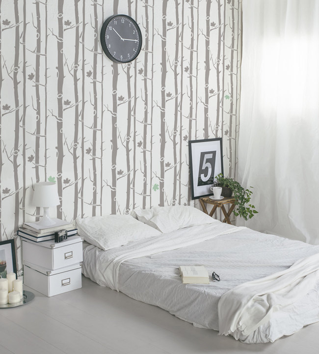
The image below shows the Siberian Taiga design (my personal favourite!) in situ in Justine Hand's child's room. You can also follow her 'how-to' of using the stencil over on Remodelista which is very handy. 

Boreal Forest stencil.jpg

I'm excited to share that StenCilit have offered for one lucky Patchwork Harmony reader to win a stencil of their choice - hurrah! All you have to do to enter is visit the StenCilit Etsy shop, and choose your favourite design. Let me know which one you love as well as how and where you might use it via a comment on this post. I will then choose my favourite reply after the closing date which is the 10th April 2015.

Merili & her team would love it if you liked their Facebook page, and shared your fave design on your Facebook too! Show them some love! :) 

Terms and Conditions:

- Please make sure to leave a contact email address with your comment so you can be informed if you win. 

- If the winner does not respond within 14 days with their postal address details, I will select another winner. 

- The competition is open to readers worldwide.

- Only comments posted before 11:59pm on the 10th April 2015 will be valid. My decision on the winning comment is final.

Here are a few more of my favourite designs to whet your appetite! I can't wait to try one of these out myself. I'm thinking perhaps on a set of plain curtains! Good luck everyone! 

Our bathroom makeover

As I mentioned in my recent 10 ideas for styling a small bathroom post, we have been redecorating our own bathroom, and now that it's all finished I thought I'd share a few snaps of it. It's really tricky getting decent photos in such a small room so this is the best I could do, but hopefully it gives a bit of an idea. 

Of course I forgot to take any decent 'before' shots and only remembered after we'd started preparing the room for painting, but these images show the beige-brown wall colour and white woodwork which has been there since we moved in over five years ago. (excuse the filler!) 

It wasn't actually that bad before, although it was definitely in need of a refresh, it was still liveable. But it was the installation of a new boiler that spurred us on, as we had the new cupboard in the corner built to house it, so this needed painting anyway. 

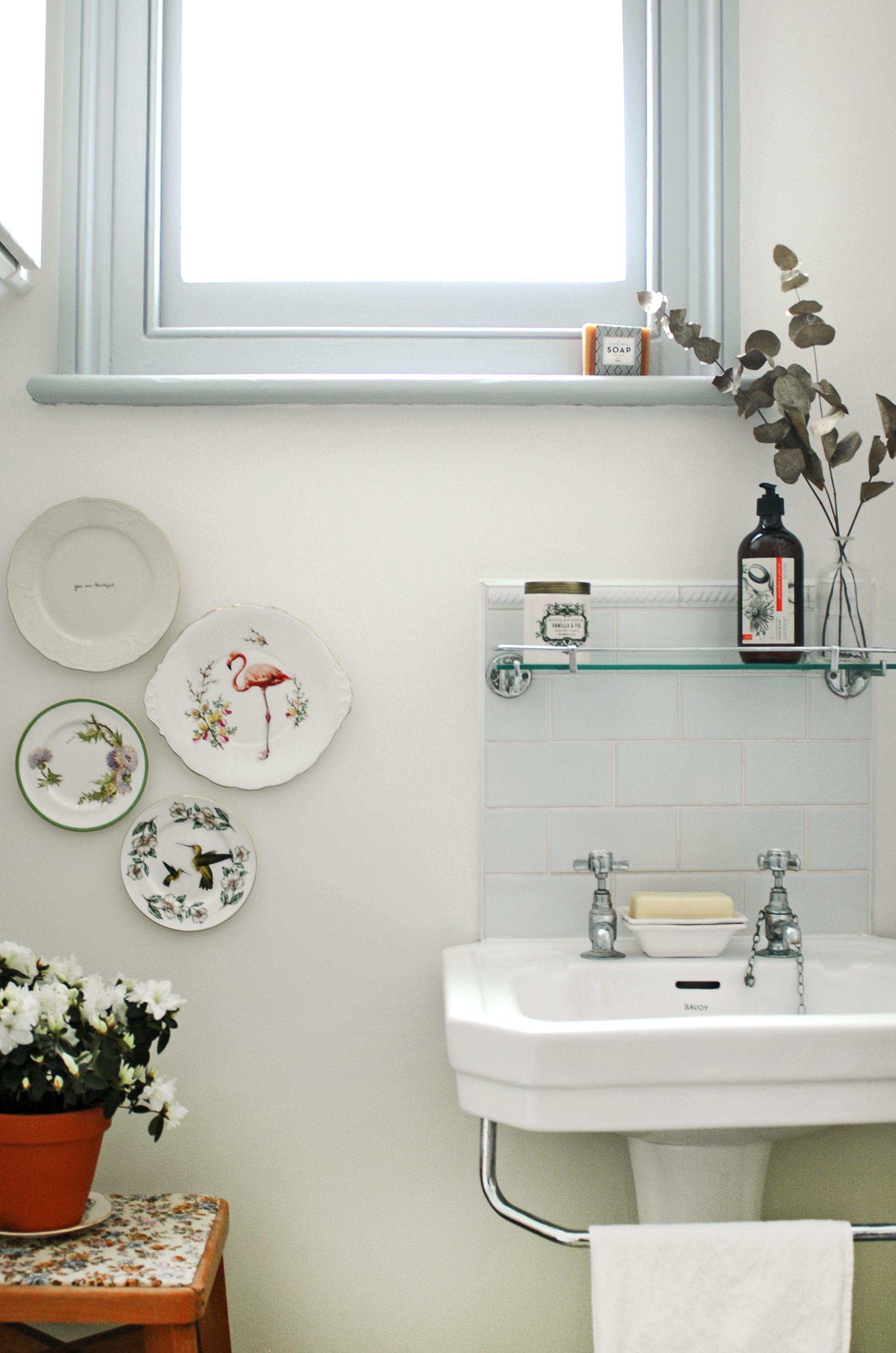
We decided to brighten the walls in plain white and used Dulux Timeless (it looks quite beige on the website, but actually comes up quite white), which is actually the colour we've used in many of the other rooms in the house. But to add a little bit of interest we painted the woodwork in a lovely shade of grey. This is Dulux Modest Grey in matt finish. I hate gloss paint which I know a lot of people use on woodwork, but I'm really pleased with the finish the matt paint has given - it seems much more modern to me. 

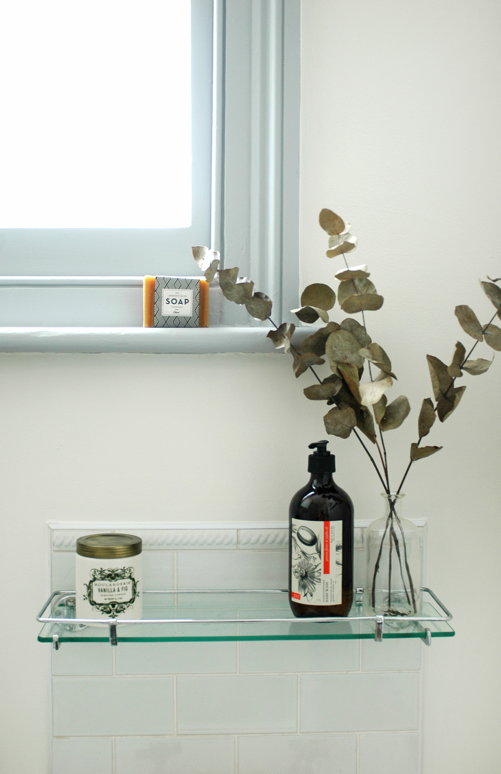
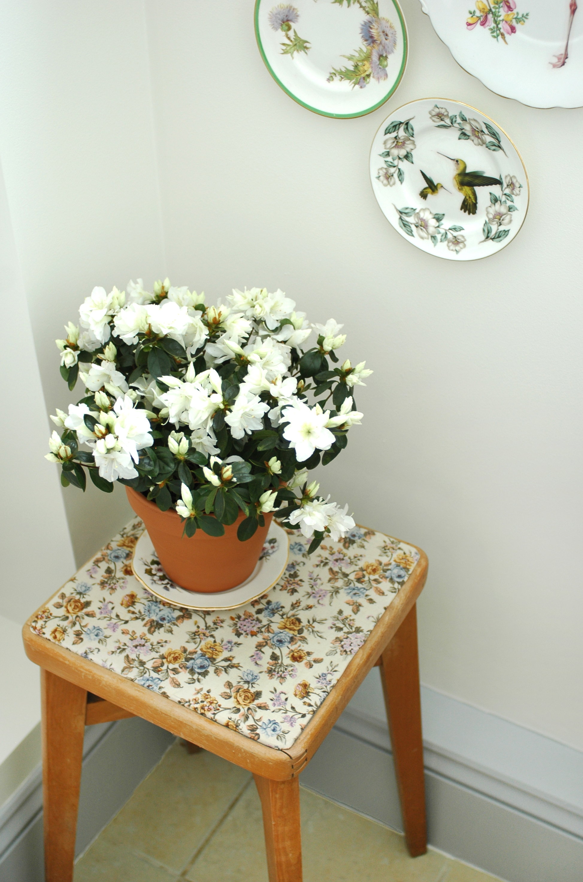
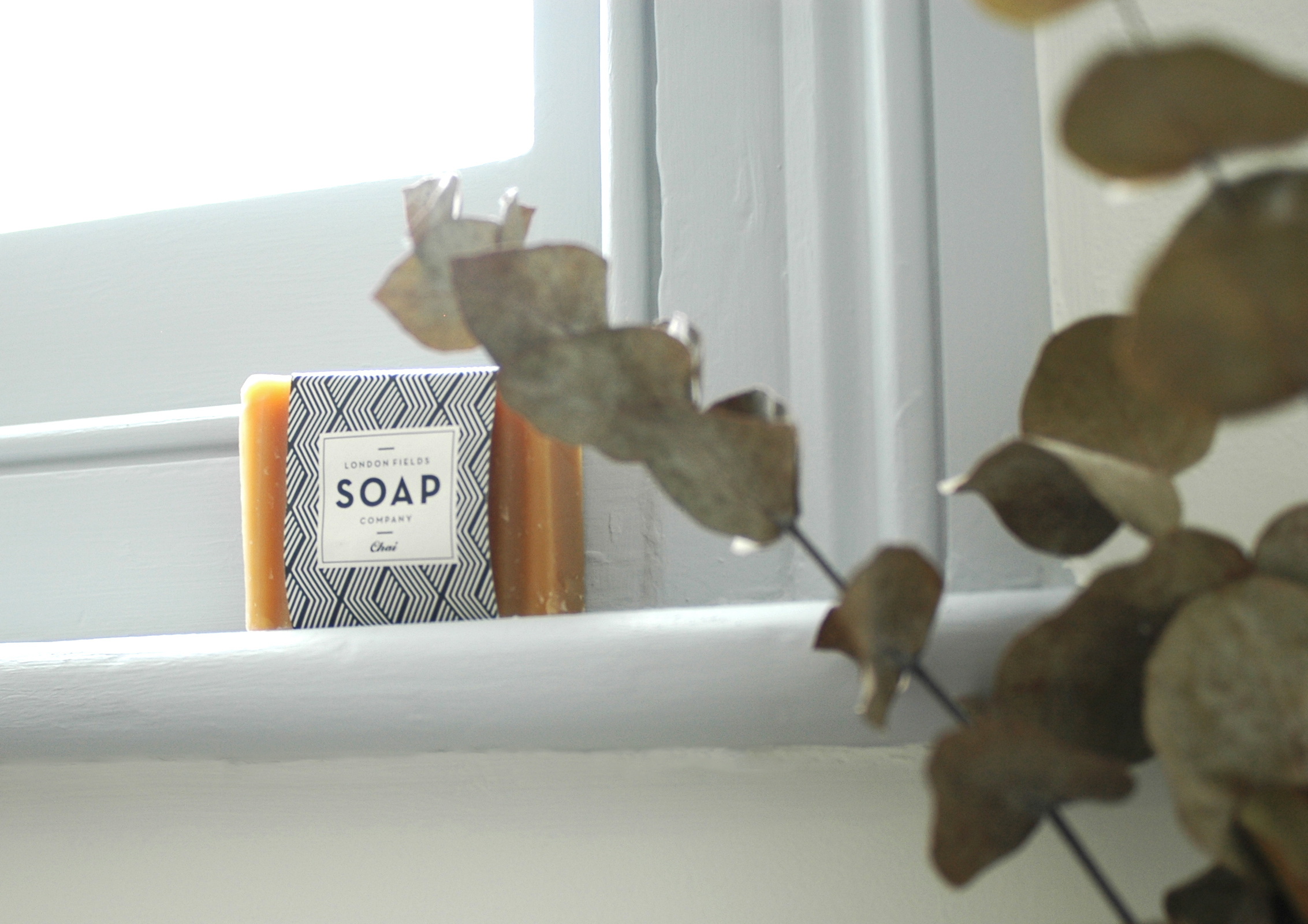
As I said in my bathroom inspiration post, I wanted to add a few simple details in the room to lift it. As it's such a small room, it only needed a select few nice items such as a delicious Anthropologie candle, and a lovely bottle of handwash which I found in TK Maxx. I've went for dried stems of eucalyptus and billy buttons in vintage bottles, and a flowering house plant for a little bit of greenery. (here's hoping I can keep this one alive!) The little bar of soap on the windowsill is from The Future Kept

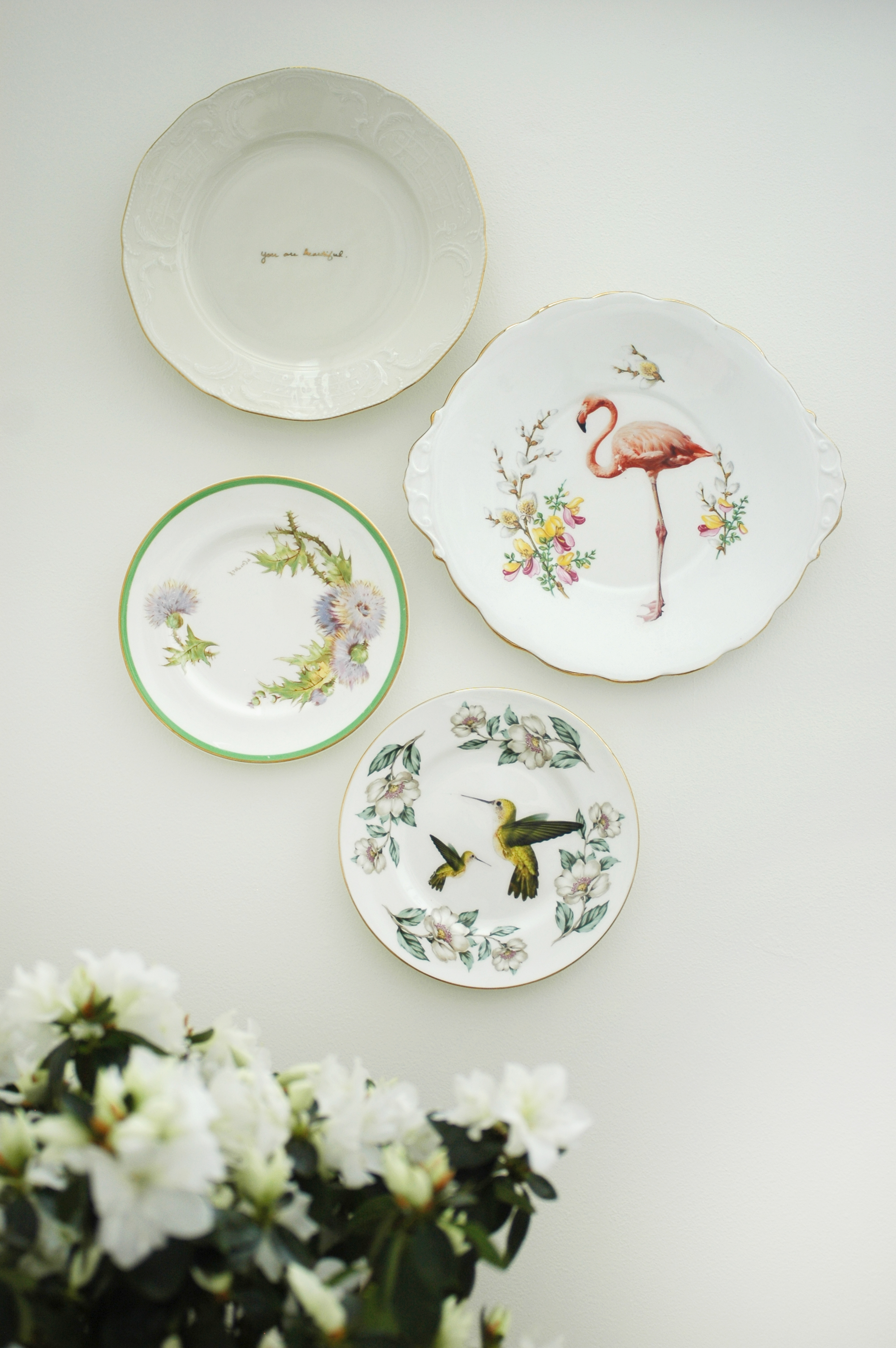
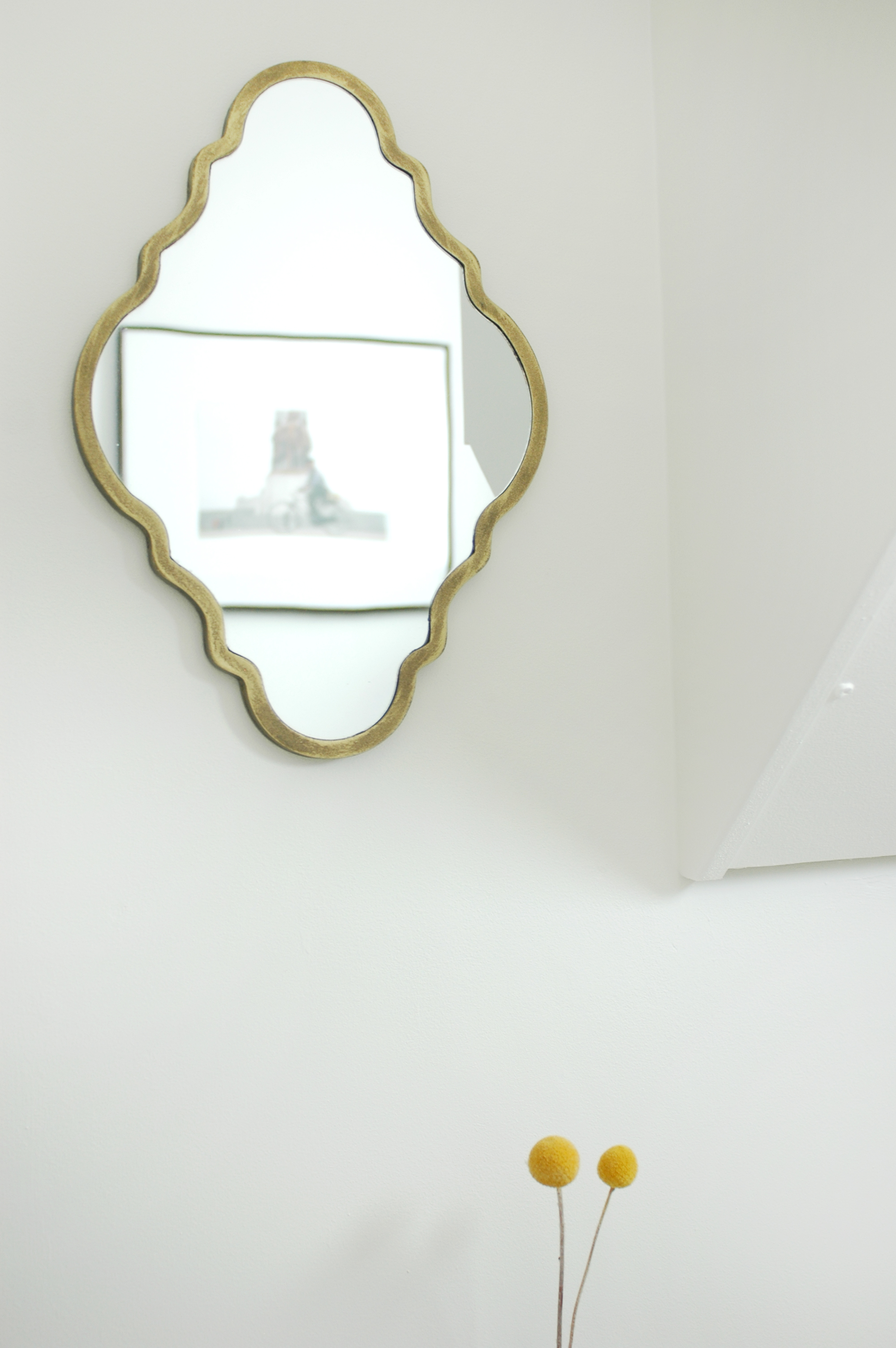
On the walls, I've hung some of my vintage plates that used to be in the hallway, a new mirror I bought from Rockett St George and in the reflection of the mirror you can see a framed print which was given to us by a friend. 

And that was basically it! A lick of paint, and a few decorative touches and it feels like a totally new room! It might be small, but your bathroom should never be neglected! :) 

A special thank you to Dulux for supplying the paint for this makeover. 

xxx

Considering carpet

I've always loved the wooden floors in our house, but it's funny, since having Ruby and knowing that she will soon be crawling and/or walking around in the not too distant future, I've started considering the idea of carpet more and more. I realise I'm not the first person to have a baby and have wooden floors, but ours are mostly original and some are pretty rickety - I often catch a sock on a nail that's started to protrude, or found a crumbling corner of board and had to discard it. 

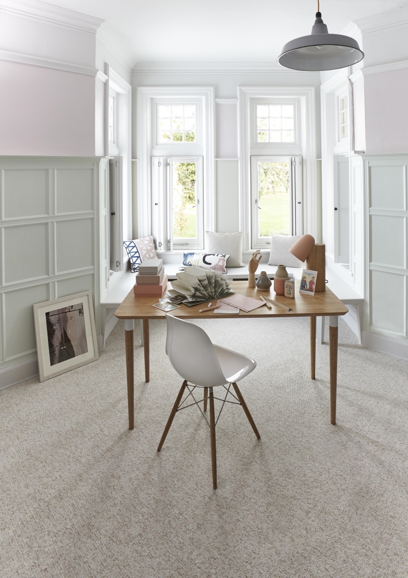
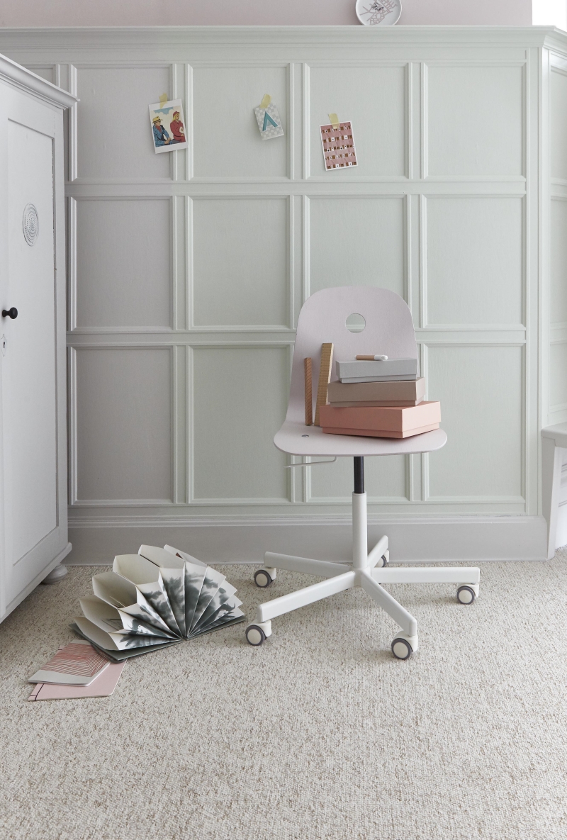
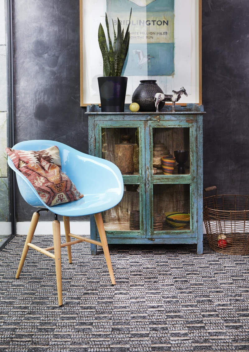
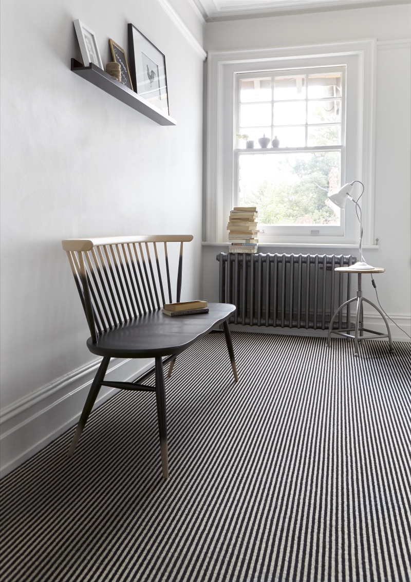
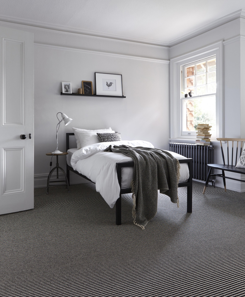
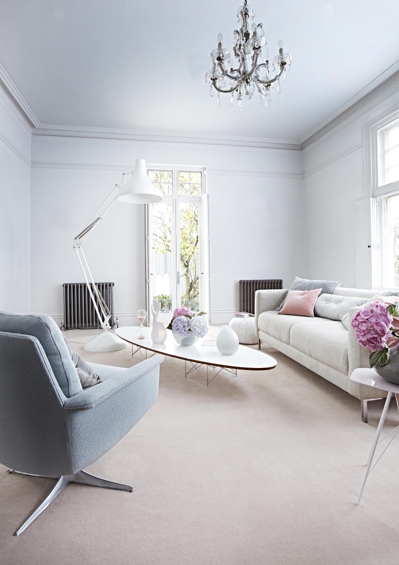
Carpet has had a rough ride of late, I guess it had fallen out of fashion for a while, but I do feel it might be due a bit of a comeback. While wooden floors do look great, you just won't get the comfort, insulation and cosyness that a lovely soft pile carpet can offer. I've been having a look around to get some carpet based inspiration, and lo and behold, Carpetright have recently released some images that show that carpet can look really quite lovely. 

What these images say to me is that you have to be really quite thoughtful about what colour and style of carpet will work with your decor, and whether you want it to be a feature or if you prefer it to be inconspicuous. But also that it can look modern, fresh and cool, as well as being practical.

I will definitely be thinking about carpet as an option when we move house later this year, and are making our new home a bit more child friendly. What do you all think? Do you have carpet and love it? Would you never entertain the idea, or are these images making you reconsider the possibility?

This post was in collaboration with Carpetright.  

10 ideas for styling a small bathroom

We are currently redecorating our bathroom, so I've been thinking a lot about the smallest room in our house of late.  When we moved in over 5 years ago, the bathroom was in pretty good nick, although not particularly exciting decor wise. I didn't do much with it to be honest, so now that we are doing it up, I plan to add a few extra touches to make it that little bit more interesting. 

Most of us aren't blessed with the gift of space in the bathroom, so it's often hard to make it look really great. If you can't fit in a wonderful roll top bath or a lovely piece of furniture like a comfy armchair or old set of drawers, what can you do with a small bathroom to give it some style? 

Here are 10 ideas I've been considering for my own bathroom. I will share some snaps of it when it's all finished....

1. Plants - pop one or two plants in the bathroom, either on a window sill, a small table or shelf or hanging from above. There are many plants that will thrive in a bathroom's humid atmosphere. Aloe Vera, ferns, mother-in-law's tongue and some orchids are all great. 

2. Small furniture - if you have a little bit of space, add a small table, stool or chair as an extra surface, and style with plants, bottles, tins etc. 

Image: Frolic blog

3. Dried or fresh flowers - just a stem or two in a bottle or vase won't take up much room and adds a little life and colour. 

4. Hooks - Look out for really interesting wall hooks that can be added to the wall or the back of the door. Not only practical in a small space, but if you go for great design, they will become a feature too.

5. Pictures, plates, mirrors - with limited space the walls are the best place to add interest, so hang artwork, vintage plates and beautiful mirrors. 

6. Stylish shower curtain - most small bathrooms mean your shower is in the bath, so a shower curtain is essential. There are lots of great designs from places like Anthropologie and Urban Outfitters if you fancy something different. 

7. Interesting fittings - I LOVE the sink in the above image! So if you are super tight on space you could always make those essential items the main feature. Wall mounted sinks should also save a little space too. 

8. Great floor tiles - With a small square footage you can splash out on slightly more expensive floors tiles and go for something really striking. 

Image: Rosehip

Image: Rosehip

9. Curtain or blind - Even if you've only got a small window, dress it up with a pretty blind or curtain. You can easily make your own with a piece of fabric, or like this image above, some vintage embroidered linens or hankies joined together. 

10. Luxury hand soap and candles - even if you've only got a tiny shelf, window sill or even just the sink surround to display items, be sure to opt for lotions and potions that come in really lovely packaging. And of course a few delicious candles won't go a miss for those relaxing evenings pampering yourself in your now beautiful bathroom! 

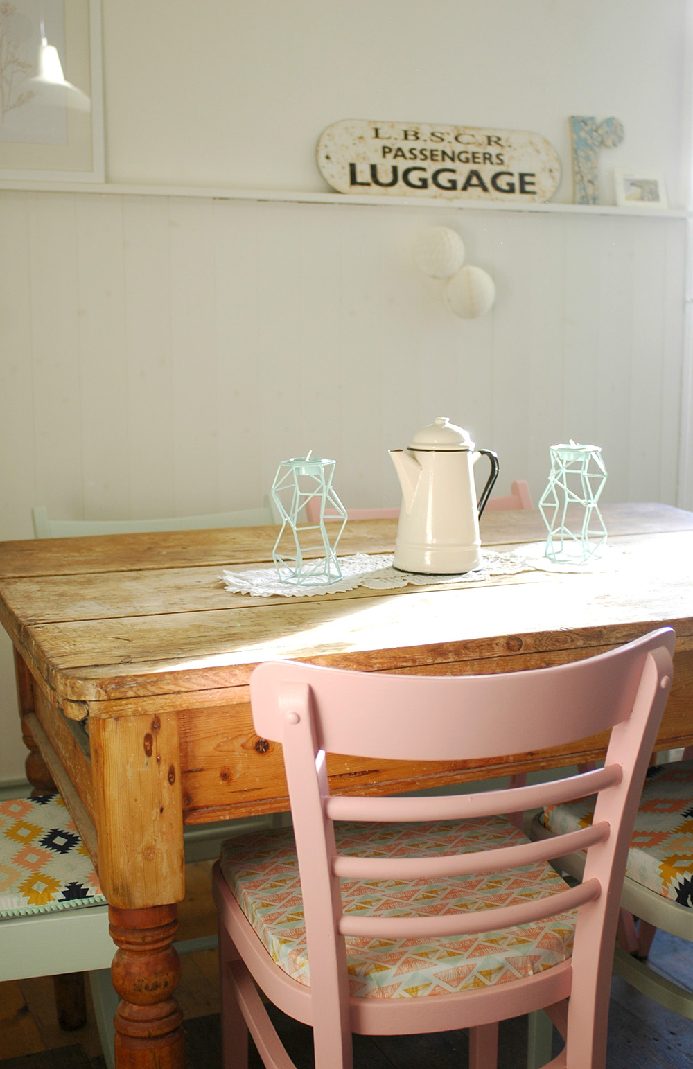
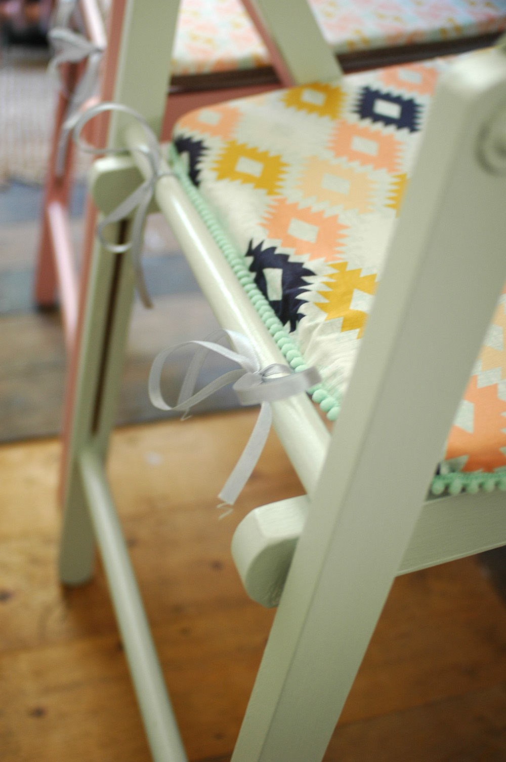
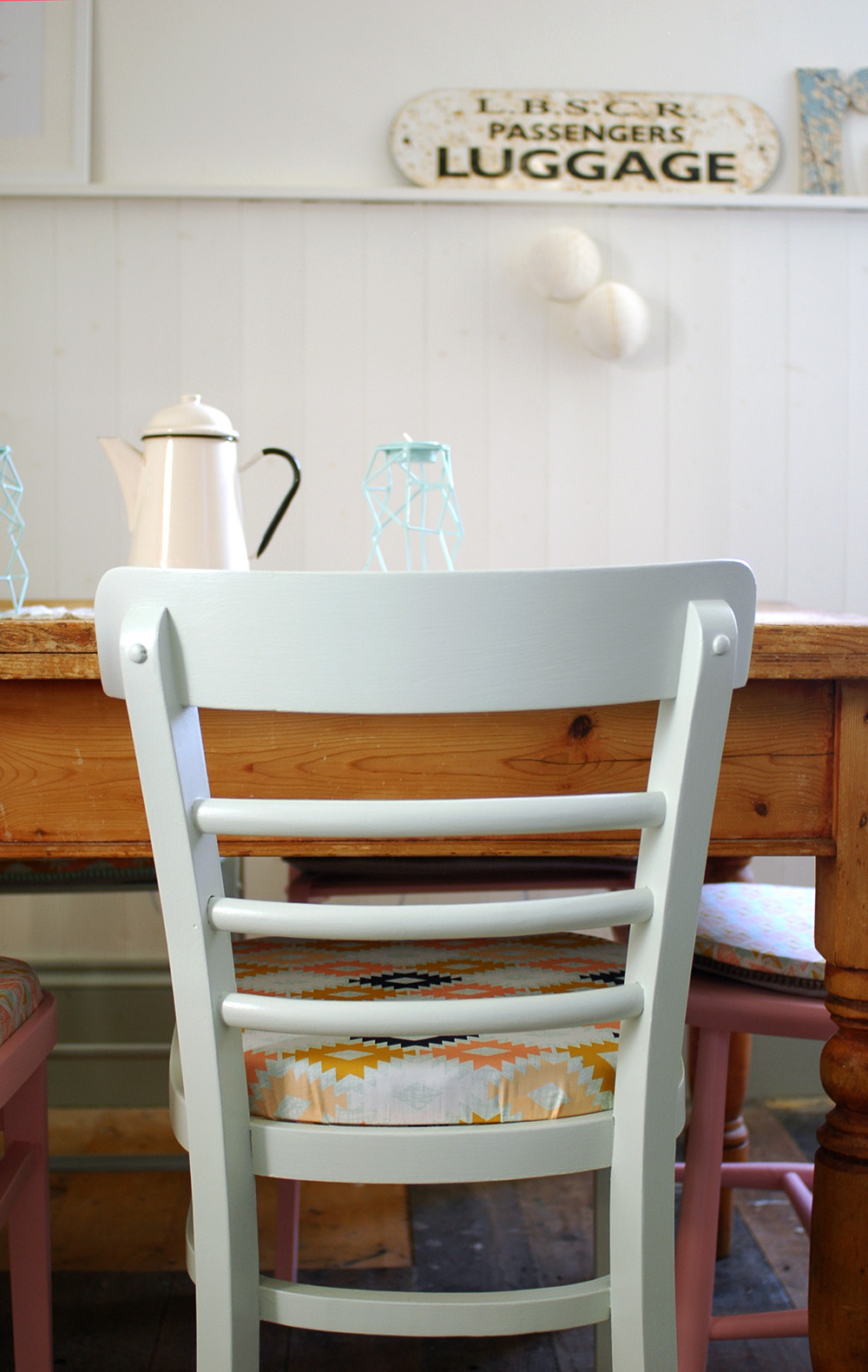
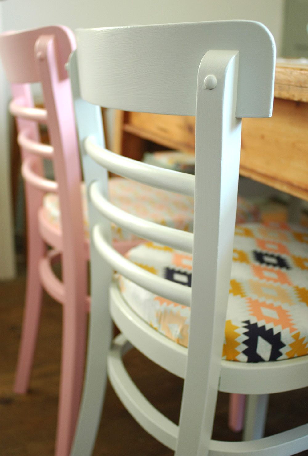
DIY: pom pom trim seat pads

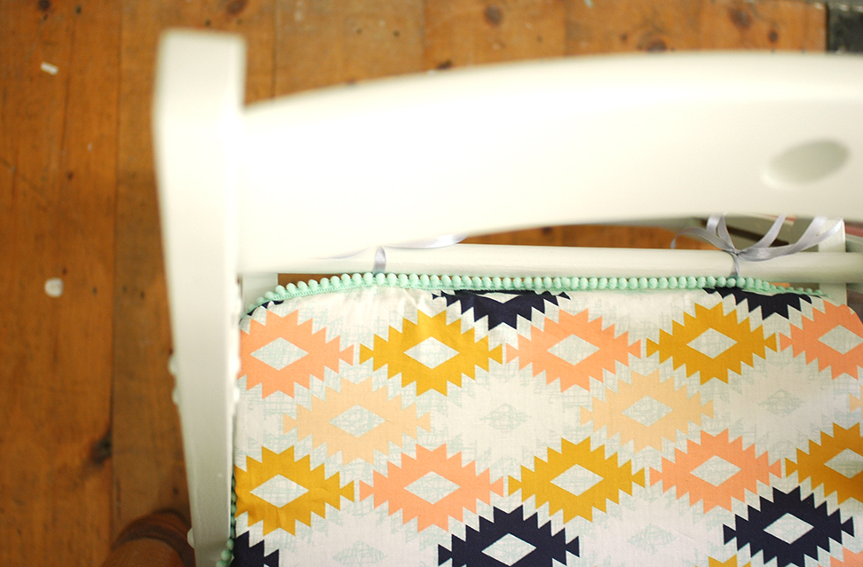
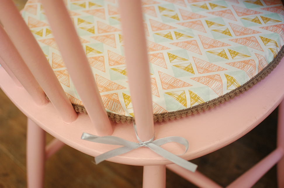
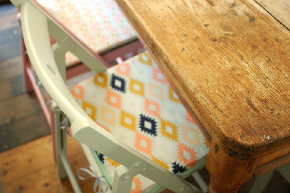
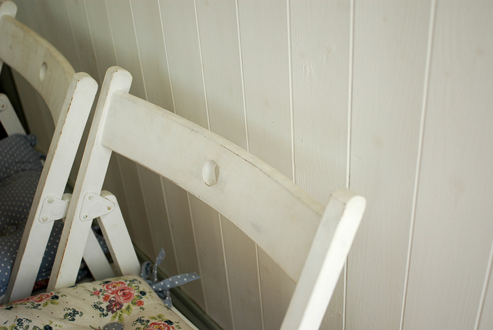
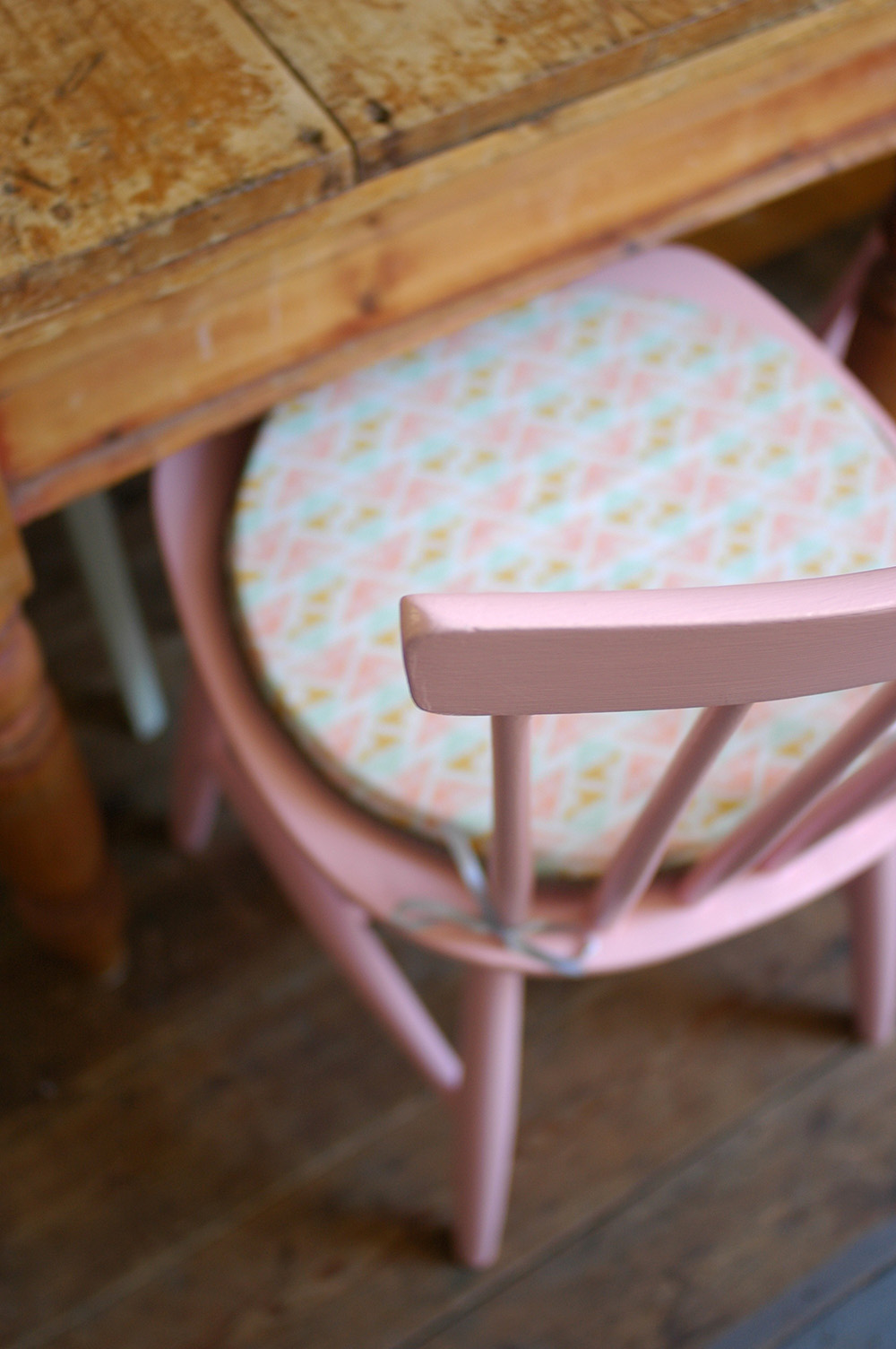
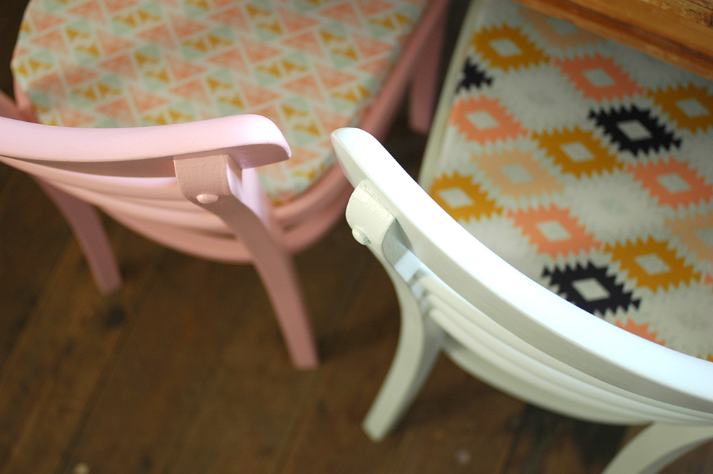
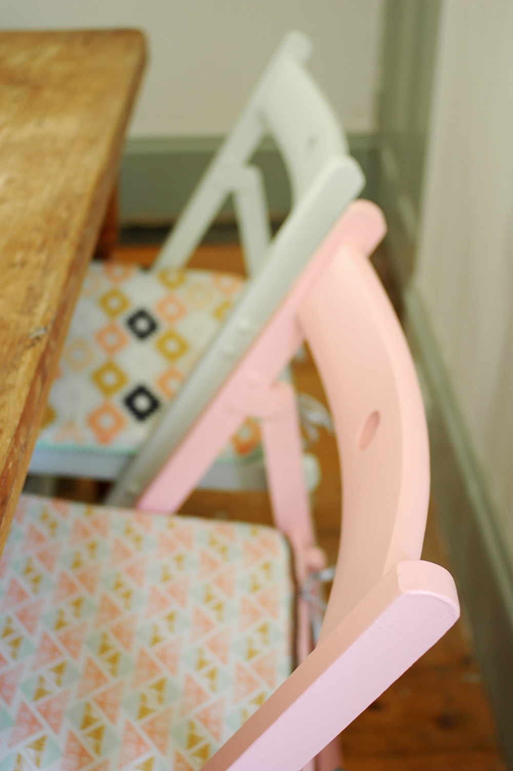
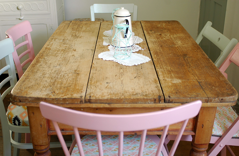
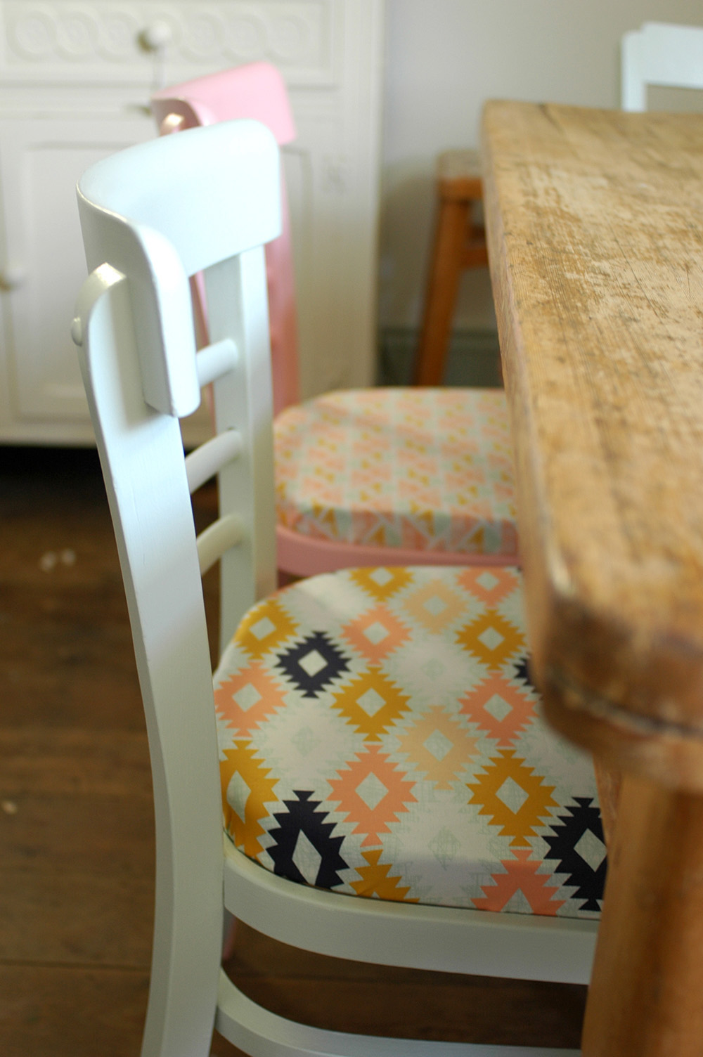
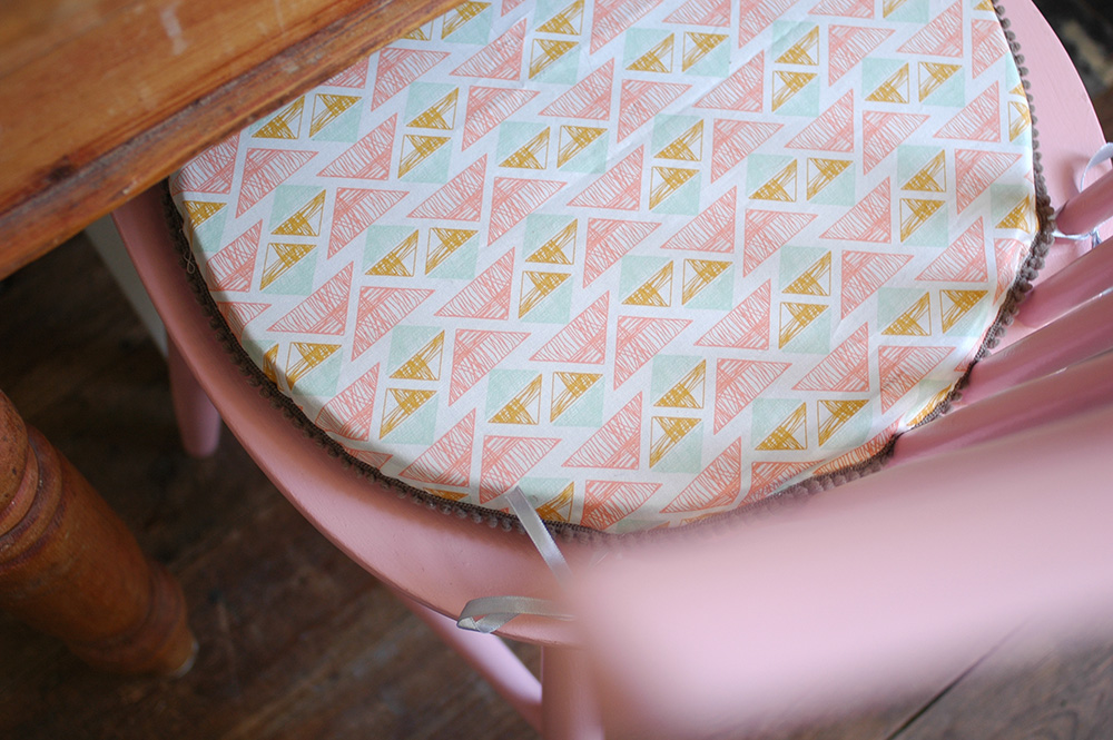
You might remember a little while ago I shared my dining chairs makeover? After painting the chairs in two Farrow and Ball colours, I decided to make seat pads to tie the look together. I chose two fabrics from M is for Make, and was able to alter the shape and size of the seat pads to match the individual chairs. My tutorial for making these is up on the AO Life blog, so if you fancy a go, pop over there for the full instructions

More book related news - Shed Decor

Last year I worked on a really great freelance project for Jacqui Small Publishing. I was picture editor on a new book by Sally Coulthard, called Shed Decor, the follow up to Shed Chic which was published back in 2009. The book focusses this time on how to decorate the interior of your shed, garden room, summerhouse or outdoor studio. The book publishes next month in the UK, but I was really excited to receive my advance copy and finally see all our hard work in print! 

sheddecorbook.jpg

Without wanting to blow my own trumpet in regards to my picture editing skills (!), but I really do love the cover image! The checkerboard floor!! and everything else in this image - just gorgeous.

Inside there are lots of great case studies of outdoor rooms from around the world, and styles to suit everyone - from rustic to retro to recycled. There are 'essentials' pages which share what elements you need to create the look, and the second half of the book then looks more closely at specific areas, such as lighting, flooring and furniture. 

Working on this project really made me want a garden shed work room more than ever!! Here are a few of my favourite images from the book: 

You can preorder your copy on Amazon now. Published by Jacqui Small Publishing.


pic credits: 1. Caroline Rowland 2-4. Carina Olander, 5. Lucas Allen, 6. Stellan Herner

Dining chairs makeover - before and after

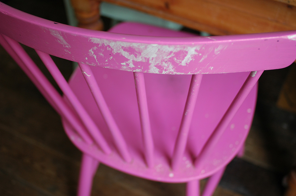
Regular readers will know that this year we had our kitchen renovated. During the building and decorating work, some things somehow managed to get ruined, even if they were packed away, and my mismatched dining chairs all ended up looking grubby, paint splattered and generally a bit tatty. 

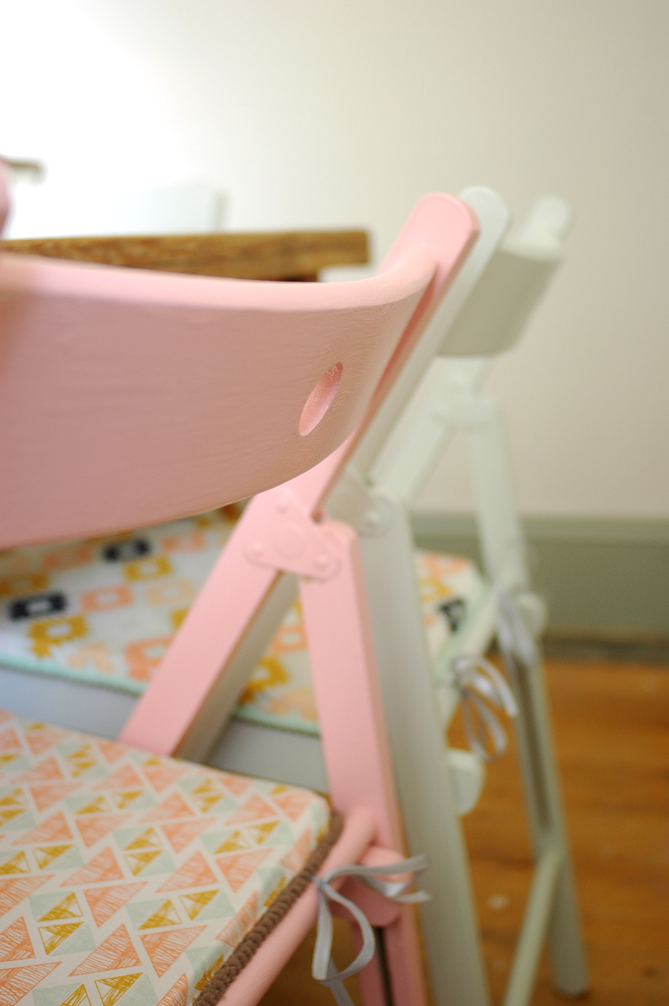
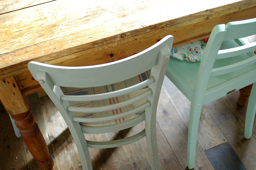
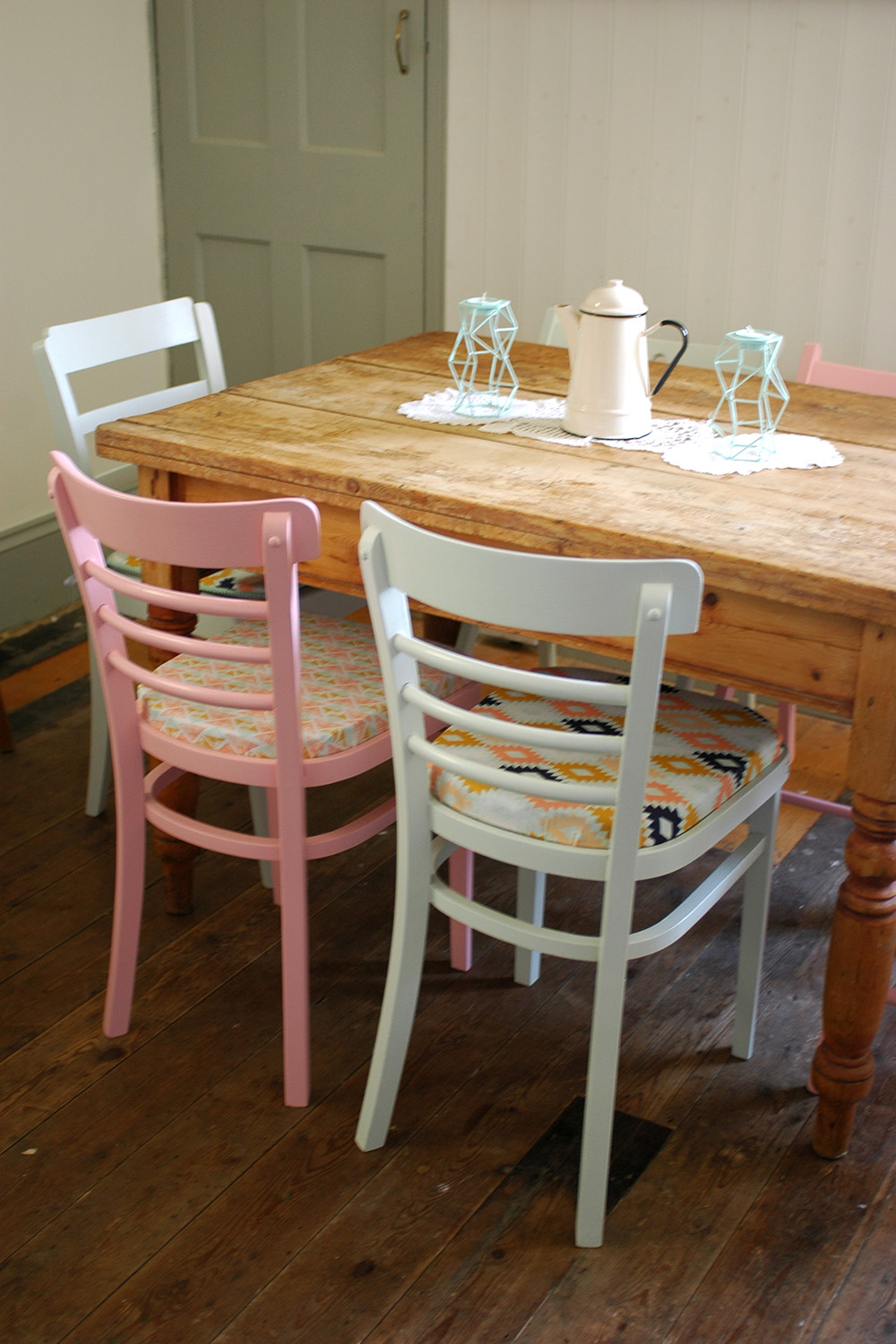
I'd been meaning to repaint them anyway for ages, so when Farrow and Ball offered me some of their paints for a makeover project, it was just what I needed to get on with it. I ordered two colours - Nancy's Blushes and Pale Powder. I decided that while my chairs are different styles (I have two pairs and two random ones), I wanted to bring some uniformity to them and thought these two colours would look great together. 

They all needed a good sanding, and I must admit I had a little help from my dad when it came to this project, sanding, priming and painting 6 chairs is not something you have a lot of time for when you have a small baby!! The chairs were primed using Farrow and Ball's Interior wood primer in white and light tones, followed by two coats of the colour.  

And here they are! I'm really pleased with the colours and the finish on the chairs, it's really brought them back to life! You must ignore the state of our floor - that is another thing on the to do list, to paint at some point!

As you'll notice I also make some new cushion pads for the chairs. This gorgeous fabric is from M is for MakeI'll be sharing the tutorial for making the cushion pads over on AO at Home in the new year so look out for that.

I'm so pleased with how the chairs now look. Thank you Farrow and Ball for the gorgeous paint, and giving me that little push I needed to get this job done! 

Check out all of the gorgeous Farrow and Ball  paint colours.